
We Need Your Feedback On A New Touring Plans Design!
As many of you know, we will be soon branching out into our very first non-theme park location: Washington, D.C. It is an exciting time for us as we bring our capabilities and tools to America’s capital. With this expansion, we are looking at new designs for the Touring Plans that will be available for D.C. and–since we have the most intelligent users of anyone–we would like your feedback.
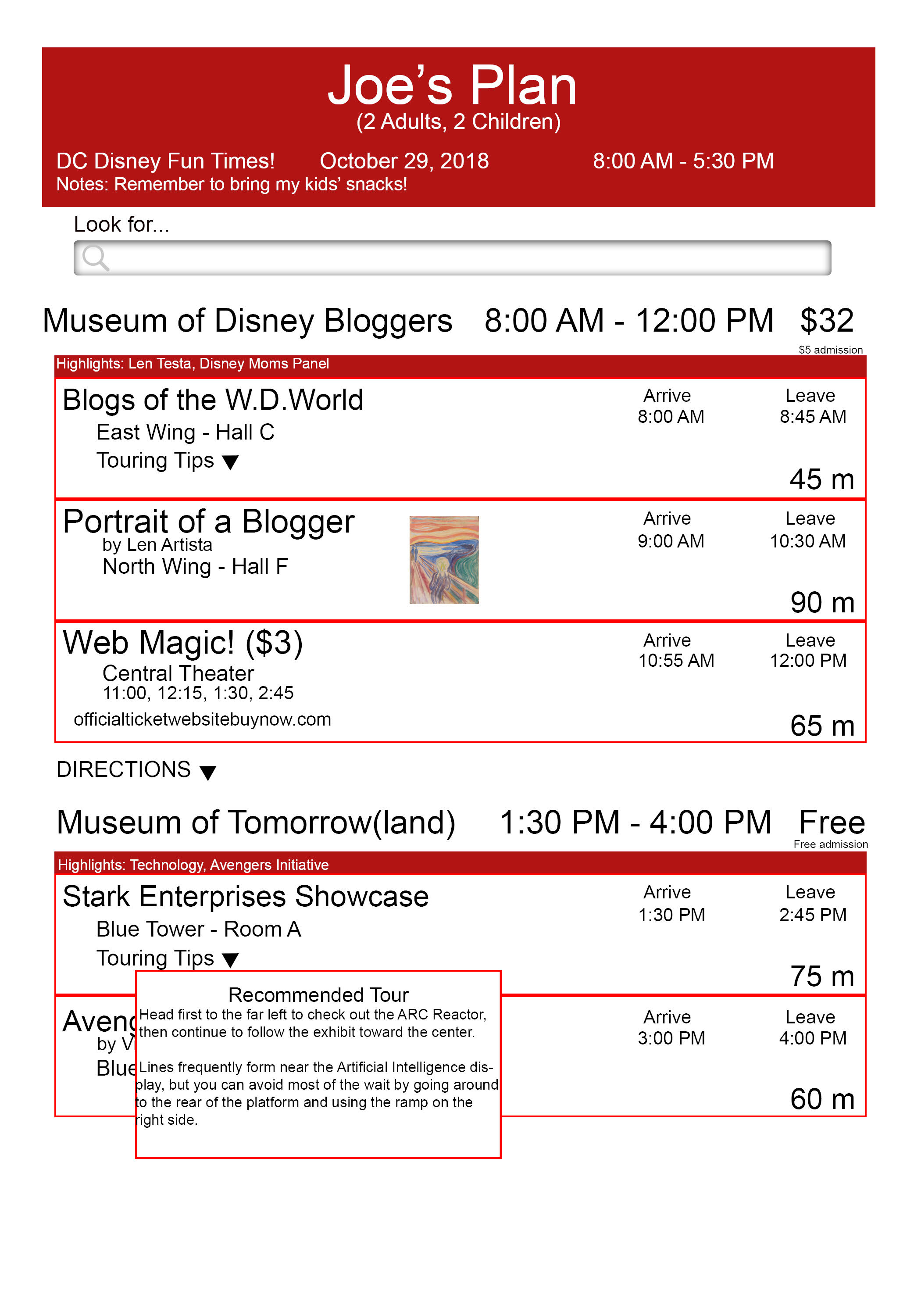
The below is *very early* example of what we’re thinking about doing. This is actually part of Phase 2 of our Washington, D.C. rollout, so don’t expect to see it until 2017. Also, please (please!) keep in mind that this is not the final product and we know that it’s not perfect.
 Naturally, we would love your opinion on any part of it, but here is what we would specifically like to hear about:
- Do you feel like the layout displays the right amount of information in an easy to read manner? Is there anything displayed that you find unimportant?
- Do you like the idea of expandable information via popup box (like the “Recommended Tour” box in the example)?
- Which of the following method of optimization would you prefer:
- Minimize Walking: If you want to see several exhibits in one room, the optimizer would always tell you to see everything in one room before moving on to another one.
- Full Optimization: The optimizer would always pick the most time-efficient plan, even if that means re-visiting one room multiple times. This one would not likely happen often, but in museums were there are very popular displays it is possible.
Thank you in advance for your input. This is the best way for us to mold our products to you and we appreciate your involvement.
You May Also Like...
-

Hopefully you've had a chance to read our first post in this series and are already hunting for your own picture…
-

I have a confession. When my kids were very young and woke up at the crack o' dawn every day, it…
-

Our Lines app (iOS / Android) now supports optimizing touring plans and timing waits in line when guests are admitted to…
-

Early Park Admission at Universal gets you into the park up to an hour before the official park opening. That means…
I really like the new layout. I think it’s a big improvement over the existing look and is already much cleaner.
1) I think the “duration” is fairly redundant to the begin/end times for each entry. I also would prefer not having the words “Arrive” and “Leave” on each attraction.
2) I’d prefer the “tips” be expandable, pushing the rest of the screen down. That way you could have as many tips open as you needed at once.
3) Ideally it would be configurable, but I’m usually up for the optimal plan even with more walking.
Since I can’t post an image in comments (that I know of), I posted a mock up of suggestions over on my blog:
http://www.185vfx.com/2016/10/touring-plans-redesign/
I tried to present most of the same information but keep the layout as easy on the eyes as possible. Hope you like some of my suggestions.
I live near DC, so I am looking forward to this! The format looks good, clean, and easy to understand. It’s colorful and sufficient, except for the ‘touring tips’ pop-up.
I HATE the ‘tour tips’ pop-up option. Too much can be crammed into that section (from ‘recommended tour’ to ‘stay to the left’ to ‘watch out for police on horses’). To me, this is extraneous stuff that people should know when they create their plan – and will just make the plan feel bogged down with details.
I would suggest ‘minimize walking’ and ‘minimize time’ as your two options – rather than ‘full optimization.’ With Disney touring plans, the automated ‘full optimization’-type option ends up changing everything and AFTER I optimize, I have to go back and reorganize by myself anyway. Most DC museums are huge, and I would never want to go back to a specific exhibition hall more than once, even if it meant waiting through the crowds. (I do NOT like crowds, but I like revisiting exhibitions even less.)
Obviously the exception would be in those exhibits (or buildings, like the Washington Monument and Holocaust Museum) where you can get timed tickets at the door, THEN return later to visit during your allotted time frame. But I don’t think ‘full optimization’ is the way to cover that. Perhaps it could be more like when you have a dining reservation at Disney instead.
I also like what one reviewer said about different speeds. My husband wants to see everything, and I zip through, too. We have actually had to split up during museum tours with our kids – husband and son saw less but read more than my other son and I did. While we would never split up at Disney, we sure have no trouble doing it when we’re all in the same building!
Good luck – I hope you get some great feedback – and pull it off as beautifully as all your other work. 🙂
1. Great layout. As a super-planner, I appreciate the information provided and do not think it is too much since it is in a clean, easy to read format that makes sense.
2. LOVE the popup box!
3. Minimize walking.
Do you mean minimize walking only within a building, or between sites? Within a building I would agree with those who say that minimizing anything except walking is not important, but I would be cool to go to a single museum early for something that gets crowded later (or a fixed time event), then hop down the block to somewhere else, then return to Museum A for a fuller experience later if that kind of optimization would make sense.
I like the drop-downs but as another commenter posted I would prefer a screen expansion (display:none vs. display:block tag change type thing) rather than a pop-out splash.
I like the thumbnail, sometimes in a large gallery it can be useful to have a rough image to hone in on.
I really like that the total time for each step is highly visible, this makes it easy to mentally adjust / plan on the spur of the moment for unexpected breaks, found treasure, etc. I love the plans, but when possible I prefer to do adjustments in my head and not in my phone.
Similarly, I love that the alternate times for the show appear in the main screen so that if you are thinking about readjusting something you have the options right there without having to jump around screens to think about what would work as a rearrangement.
And again along those lines, I like that the price is shown clearly, but I’m of mixed minds — as a budgeting feature I think it’s great, but I’m not sure how much value added there is in day-of use for this information. I would prefer to see the museum hours instead if I had to choose between the two, because the Museum Hours would be important if I was trying to make decisions on the fly about how I might potentially deviate.
As someone who has lived in DC and been the tour guide for visiting relatives, I think this is great! I think it is a good amount of information & agree with others that a print option would be helpful.
Absolutely minimize walking. Other than making specific showtimes, most exhibits don’t have wait times to strategize around like Disney rides do. I’d use the list as a reminder of which exhibits & shows I didn’t want to miss, mainly.
Absolutely on the pop ups for more info on recommendations.
Does the touring plan treat each room as a single item? I’m assuming no based upon your third question, but nothing in the picture indicates that there is another level of data below this schedule.
I would like to see personalized touring tips. Example: Blog room, remember touringplans.com and check out the info. (Or something along those lines.)
Does the time frame reflect that the user has selected particular exhibits to view? Or is it a generic time frame based upon the room as a whole?
I like the “leave” time – does that include some give? In that, I’m assuming it’s not a true 15 minute walk from Blogs to Portraits. (Is the walking time a variable that can be set?)
As a first public pass, I think you guys did a great job!
Will this have the option to choose “slow museum tour-er” vs. “fast museum tour-er”? I can whip through a museum fairly quickly, but my husband likes to read every single plaque and every single description of every single exhibit. We would have completely different touring plans if doing the museums separately.
I always print my plan in case my phone battery dies. Would the pop-up information show up on a printed copy of the plan? I like the idea of a pop-up though.
It would be nice to have a print option that would allow you to print the drop downs. I agree with the minimize walking plans. I am very excited to see you roll this out. I cannot wait to take my daughter to D.C. In a few years.
1) Think the layout is pretty good. Like the idea of having thumbnails or bullets of what’s in the room next to the room name/number (like you have with The Scream in the example).
2) Like the idea of the pop-up box, but think I’d prefer a style where you click the little arrow, and the info appears, dropping the rest of the page down, as opposed to hovering over the information below it.
3) Definitely Minimize Walking would be my preference.
Great stuff TP team!
I like the easy to read layout.
Pop up with tips is great.
I would prefer full optimization, but having toured DC with both seniors and pre- schoolers, I understand less walking options are important. (sorry, not very decisive)
1) It’s not enough info. The old plan shows more info. I would like to this layout with that info.
2) Yes. I lovd this idea.
3)minimize is the only way to go. We are there 10 days and we need to conserve our energy.
I LOVE this! I would totally use this the next time I went to DC!
1. I love the layout, especially the “leave by” in order to help pace yourself.
2. The pop outs are great!
3. My vote is for the minimize walking. I think it would be too confusing to keep jumping back and forth, and would spend more time looking for the thing you are supposed to see rather than just going through the room.
I can’t wait for the next expansion of the Smithsonian Institution, the Museum of Disney Bloggers!
1. Yes, like that you include a link to buy the required tickets. I think the picture under “Portrait of a Blogger” takes away from the streamlineness (is that even a word?) of the layout, I would prefer it removed.
2. Yes, it provides a quick reference.
3. Minimize walking. Even if I wasn’t, I would *feel* like I was wasting time if I kept leaving and returning to the same room/area.