Hour-by-Hour Look at Disney Park Crowd Levels – Revisited
Earlier this year I wrote a blog post showing heat maps with hour-by-hour park crowd levels. My intention was to illustrate how the crowd levels fluctuate during the day, and we received requests to add these charts to the TouringPlans website.
Personally, I think the charts are most useful if they are customized to specific travel dates. Here is an example for my next trip in February.
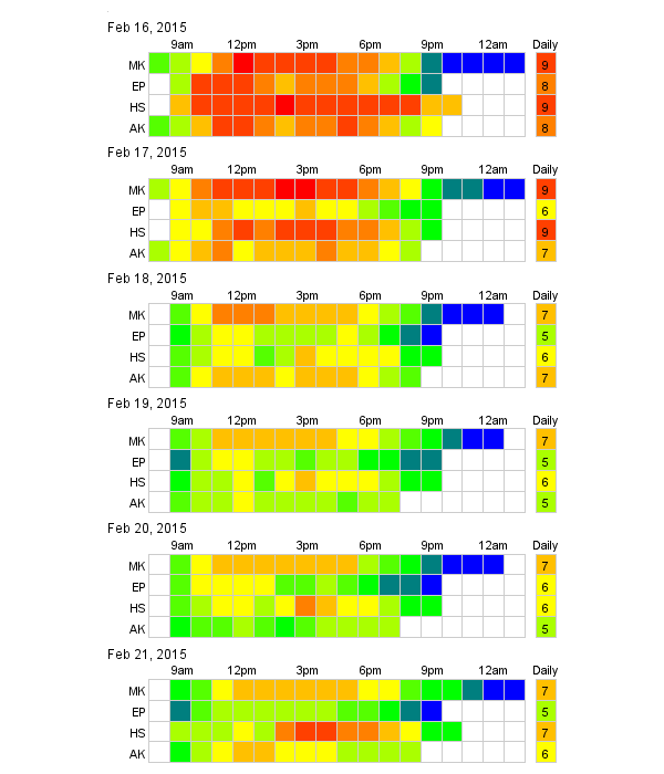
If you mouse over the chart, each box will show the crowd level for each hour. Blue is a crowd level of 1, and red is a crowd level of 10. Do you find this type of chart useful? Would you like these charts as part of the Crowd Tracker or as part of the Dashboard?
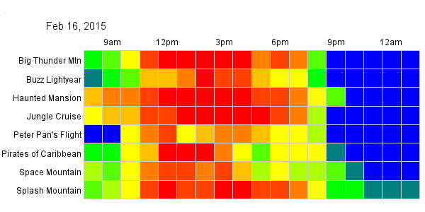
The same type of heat charts can be used at the attraction level. The color is based on the attraction-specific crowd level, so a red Buzz Lightyear wait time is different from a red Space Mountain wait time. The hourly predicted posted wait times are available when you mouse over the boxes. Daily predicted wait times for attractions can be seen at the on the Wait Times pages of the TouringPlans website.
Let us know if you find these charts useful and if you would like to see them added to the TouringPlans website.
Updated 2:00 pm January 1, 20015:
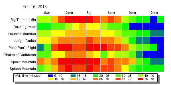
Here is the same data as the above attraction chart with the colors equivalent across attractions.
You May Also Like...
-

This weekend will have the longest park hours since Walt Disney World re-opened in July. Extended park hours are a signal…
-

When I first saw the Disney Park Pals, I was so confused. What do they do? I thought to myself. I asked…
-

Even on the busiest day, getting to a Disney theme park early can be a magical time. Many times you are…
-

The parks are reopening soon (July 11 for the Magic Kingdom and Disney's Animal Kingdom and July 15 for Disney's Hollywood…
Has this been added to the touringplans.com website yet and if so where can I find it? I would love to share this with my clients! Thanks for all your hard work!
We are working on it. The logic has been handed over to the developers to integrate into our application.
I think this would be a very useful planning feature. Going a step or two further and combining this with the overall resort-wide crowd data and providing for a “drill down” option would be a great help in planning a trip.
You could start with a complete year view giving overall crowd levels. From there, select a data range to drill down into. For the given date range you could show park-level crowd info. Then you could go further down to the attraction level by clicking on an individual park.
Oh, and add it to the Lines app, of course!
Thanks,
-Brett.
Yes!!!! Amazing
Love this! Please add them as I love to plan my rope drop mornings as perfectly as possible. Hey – if I’m gonna get up that early I should make the best of it, right? This would be awesome!
Yes, please!!
What I find really interesting is that for years the prevailing wisdom is to get to rope drop. With little kids, this makes sense. And yet… it seems there’s much more “1” & “2” time late at night than there is in the morning… so having a “sleep in late” day, or two (or three?) might actually make more sense.
What is the TP team’s thought about this? I find the data intriguing, and the “color picture” is a very nifty useful visual.
Late nights are good for lower crowds. I suspect that the relatively early drop off in crowds are related to the evening temperatures in February. During the summer the drop off will be much later.
For the optimal touring you should do rope-drop, close down the park, and take a mid-day break.
I feel rope-drop was more of necessity before FastPass+. Now you can book your fastpasses for your late arrival and then take advantage of guests leaving in the evening.
Yes, great charts. Will be there on those exact dates as well!
Exceptional. The second version of individual attraction wait times is fantastic.
FANTASTIC idea. Would love to see this for specific dates.
Yes, very helpful for all us planners. Hourly helps us take it to the next level!
YES, Please!
Yes, yes, yes please. These heat charts excel in making complicated data easy to comprehend, and the “by attractions” table makes it easy to see what will be busy, and when it will stop.
Yes, these would be helpful
Yes! Time of day makes a huge difference, and us locals can make very good use of this data when choosing which park to visit after your teenager finally gets up at 1 PM 🙂
I second the motion to do this for Universal as well, if sufficient data exists. Universal’s spontaneity-friendly environment vs. Disney’s hyper-planning is increasing its popularity with your Orlando subscribers I suspect.
Yes please — for Disneyland too — next trip is there (for the 1st time).
🙂
I’m with others about loving charts.
my inner tech nerd loves these charts. Thanks.
Yes! Absolutely helpful! This helps decide what part to go to depending on our plans, helps decide fastpasses and even standby lines. This helps take the guess out of things saving me even more time (and makes planning more fun for this Disney fanatic!)
The charts are very useful, except I anticipate has having one color representing different wait times will be confusing. I.e. that a 9 for splash mountain might be different than a 9 for Dumbo.
From my family’s perspective for example, we’re more interested in absolute wait times (which queues are longer than 20 minutes, for example).
I added a chart with the colors normalized across attraction. Let me know what you think.
Yes, please! This would be super helpful with planning and park hopping.
I forgot to add, they would be great as part of the dashboard.
This would be great for planning when to try for Fast passes! YES, please make this tool customizable for specific days.
Awesome idea!!! This would be a wonderful addition to Touring Plans!
Yes this is awesome!
Yes please! Love these charts.
This would be a great help. Please post them!
What about an option to normalize the colors for attractions. This makes a red at space mountain equal a red at buzz lightyear. I would then know that I have the option to go to either ride, the wait is the same. The way you show it, space mountain might be faster than buzz but you use the same color making it harder to tell.
I added a chart with the colors normalized across attraction. Let me know what you think.
As a longtime subscriber and planner, I would love to see this added immediately. It would be very helpful in touring plans and FP+ for our March trip
Yes please, this would be very helpful in planning our days.
I would love this to be added to the site!
I would love to have these available. It helps make the case to my hubby that he needs to get up and moving in the morning. 🙂
These would be brilliant, please add them 🙂
Love it! Please add!
That would be a great tool…especially if we enter a trip into our touring plan!
Yes, these are very helpful! Would love to have them on the web site.
YES YES YES, this would be phenomenal to be able to convince my family to get up and out the door for park opening!
YES! YES! YES!
Yes, please do add these. Provide invaluable insight into general crowd trends and very useful for planning your day!
Add them and add them quickly!! Super helpful for quick glances at each tracked day. Will help plan upcoming days more easily. Awesome. Love graphs!!
I would love to see this added to my crowd tracker as soon as possible! This looks invaluable for planning.
Super Pawesome!!! This is very beary useful to me when planning my day. Especially on my park hopping days.
Thanks!
YES PLEASE!!! Preferably for Universal between Feb 14 and Feb 21 😉
These dates actually overlap with my trip, so I love this post even more. Thanks for sharing!