An Hour-by-Hour Look at Disney Park Crowd Levels
When touring a Disney theme park, two good ideas are to arrive early and take a mid-day break outside of the theme parks. Even on crowded days, arriving early means that you’ll have relatively low waits for a couple of hours, because most people sleep in on vacation. And a mid-day break means you’ll miss the hottest, most crowded part of the day.
To make this point visually, we’ve created a set of sample charts showing how the crowds build during the day, for sample days at Animal Kingdom, Hollywood Studios, and Magic Kingdom.
If you move your mouse over each box, you will see the hourly crowd value. For reference, the daily park crowd level is listed on the right of the charts.
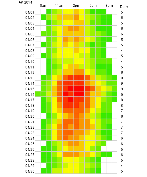
The April chart for Animal Kingdom show the expected crowd for Easter week:
Animal Kingdom April 2014
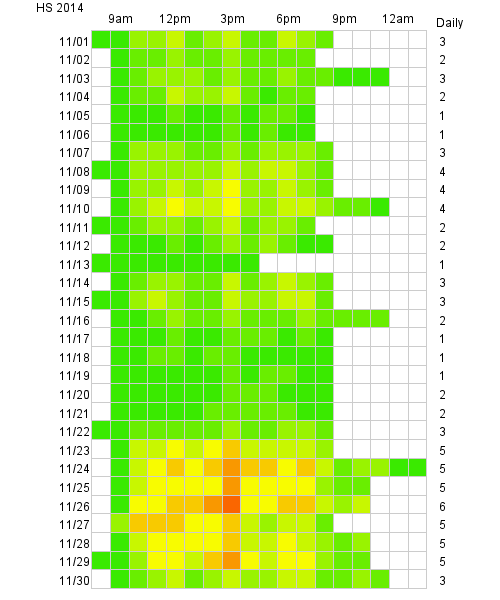
Here’s November at Hollywood Studios:
Hollywood Studios November 2014
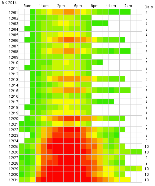
When the Magic Kingdom closes early for parties, those days typically have lower crows levels. The adjacent days have higher crowds as guest see more value in their park ticket when the Magic Kingdom stays open later and has fireworks:
Magic Kingdom December 2014
You May Also Like...
-
This weekend will have the longest park hours since Walt Disney World re-opened in July. Extended park hours are a signal…
-

When I first saw the Disney Park Pals, I was so confused. What do they do? I thought to myself. I asked…
-
The April Crowd Calendar update only has minor changes. We are halfway through spring break, and crowd levels have been in-line…
-

The parks are reopening soon (July 11 for the Magic Kingdom and Disney's Animal Kingdom and July 15 for Disney's Hollywood…
Love this! Would be great if it was added to the website… Please include the Disneyland parks!
Pawsome!
These charts are AMAZING! I agree that I would love to have these for every park for each month!
I LOVE this! I love working with color charts. They make at a glance referencing so quick and easy. I’d pay extra for these!
I would LOVE to have these for every month as part of the subscription…!!!
This is great to show those members of our traveling party who don’t want to get up and moving in the morning!
Really sweet op analysis! Add to the app!
Agree with the others. These are super awesome and I want the full set. Love heat maps!
Great visual. Easier to see and understand when looking for the best time to go in any given month. I really like the time zones from RD to Close. Would love to see it as part of my subscription.
Len, Calling Len Testa! WOW, the next generation of TP Crowd Hours is at hand! You are THE Man (but only if you make this 29/7/265 🙂
I would love to see this for each month as well! Thanks for putting this together, it looks awesome!
Is there any way that you could do each park for each month? This is incredible data, and I hope you see how much your work helps others. We all really appreciate everything you do!
Amazing. I would love to use these to help plan my next trip. The numerical crowd levels are great, but this breaks it down even further. LOVE!
This is awesome! I agree with Greg, I would love to have access to charts like this with our subscription! thanks for the post 🙂
Very cool visualizations!
This is great stuff! I’m reading on my phone, so perhaps I’m not seeing it, but is there a key to what the colors represent numerically?
Yes, same question from me. Thanks.
These look beautiful.
Bright green is a 1, yellow is a 5, and red is a 10. On a computer, if you mouse over each square will give you a specific crowd level.
Super! Thanks.
I would love to see this for all the parks for April 2014! Love the visual!
This is awesome. Is the hourly data currently available on the site?
Seconded that this would be a great addition to the data you already provide! Love some charts and graphs.
These are awesome. You should make them available as part of the subscription.
Agreed, and agreed!
Make that a third!!
And a forth
yes, this would definitely be helpful in planning
In fact, a sample chart like this would not be remiss in the guidebook itself. Just to give an idea of when to time the mid-day break.
I agree! This would be an awesome addition.