Foto Face-off Friday – Studios Icon Throwdown
Congratulations on making it to the conclusion of another work week! As you count down the hours until your weekend begins, here is a visual treat! In this somewhat different edition of Foto Face-off Friday, the weekly blog that features photographs from our TouringPlans Flickr Group that are an extension of the Disney Debates we’ve been holding on our Twitter Account, @TouringPlans, we will attempt to resolve one of Walt Disney World’s “biggest controversies,” which is the best current or potential Studios Icon: the Big Sorcerer’s Hat, Grauman’s Chinese Theatre, Tower of Terror, or the Earful Tower. Since pictures speak louder than words we’ve decided to seek definitive resolution photographically for this especially hotly contested Disney Debate!
Unlike last week’s Face-off, this week’s “throwdown” was hotly contested from the beginning. Our followers on Twitter spoke sharply on the issue, almost always unequivocally preferring one icon over all others. Here’s what a some had to say:
@tperlmutter I’d have to go with ToT because its the only one that’s not obscured from within the park & stands out outside the park
@mainstgazette The Hollywood that was and never will be is totally summed up in Grauman’s Theatre. #disneydebate
@Fizzy27I like the little mickey that spins around on top of the crossroads thing but I guess he is too small for an icon.
@kennypirate graumans. Get rid of the giant pin shop and restore the beauty and openess of the area
@757hokie757 DHS needs to build the Monsters Inc “Doors” dark ride and THAT can be the new park icon!
@cmdisbrow totally Grauman’s Theatre. The icon of that park since opening in 1989.
@scarlettashley1 Earful Tower. To me that says DHS. The sorc hat just reminds me of the entrance to DTD from DL hotel (if it’s still there).
@scottinwdw since when is ToT up for DHS icon status? anyway, I think it should be the Earful Tower and the BAH should be demolished
@KippWade I don’t know what it should be. I know that it should NOT be the water tower – too much like WB Studios
@mattj4226 Mr. Iger, TEAR DOWN that HAT! #disneydebate
@h2mc Chinese Theatre. It’s the castle!
@dotkirk Theatre. Earful Tower is nice but small. Hat is obnoxious. Theatre is large and majestic.
Based on the Twitter responses, I was fairly confident that the throw-down would be equally divisive among our Flickrites. Surprisingly, the group started out heavily favoring the Sorcerer’s Hat. After reading such animosity towards the Hat on a number of Disney fan forums, I was shocked, to say the least. However, entries started to even out early in the week.
Along with their photo entries, we asked for an explanation as to why each poster preferred their respective choice. Their reasons may pertain to photography, general enjoyment of the choice, or both. Their personal thoughts are provided below their photo-entry. To view more of their photography click on their respective submission, which will direct you to their Flickr photostream. It was such a good week in the Flickr group with great photos and thoughtful explanations that I just felt I couldn’t limit it to the best ten. Plus, this is a throwdown, rather than a face-off, so technically, I should be able to include up to twenty entries (that’s my justification and I’m stickin’ to it. Plus, does anyone really mind seeing more excellent photos?!
We’ll start with the Big Sorcerer Hat entries:
nikoboivin:

My choice is based on the other icons of WDW. It’s big. You see it the moment you enter the park. People relate to this when they want other people to know what park they are talking about. It’s also usually in the middle of the park (except for SSE, but it’s in the middle of future world!). With these informations, the Chinese Theater would have been the Icon, but now, it really has to be the Sorcerer’s Hat.
Corsey21:
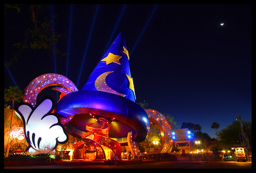
When Walt Disney was building Disneyland he made Sleeping Beauty Castle be the “weenie”. He placed it at the end of Main Street so that all the guests would be drawn or “weaned” towards the center of the park. That’s why you never see the main icon at the entrances or off the the sides, and if you follow the formula that every park icon is the giant subject smack dab in the middle of each park, that leads us to the Sorcer Hat as the winner.
CenterLine 717:
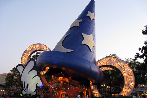
I would have to say that the Sorcerer’s hat would qualify as the main icon to the park. I think it is what most people would identify with Hollywood Studios and it is the icon you see as you enter the park. I’m not saying that I don’t think that the Grauman’s Chinese Theatre or the Earful Tower wouldn’t make good icons. It’s just that the Sorcerer’s Hat has the size, location and the draw. As Corsey21 said above, it follows the formula of what the park icon should be.
Penglynns:
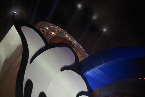
The hat is the only icon that gives you a thumbs up… AND the only one you can “wear” (via creative photography).
Isabelle Boivin:
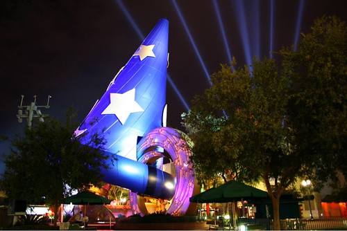
Obviously, Disney decided that it is the hat… and it is beautiful, but it’s hard to find why you would link a “studios” parks with the Mickey’s sorcerer hat! The chinese theater would have been perfect for the “everything hollywood” theme. It would have needed just a little “sparkle” at night… but there came the hat ! So…every one now refers to the hat.
Photogineer (Doug):

I would have to vote for the BAH. I know there is controversy on this but it just has a better feel to me with a Disney subject. The BAH also is so much easier to explain to people on where to meet that the theater. I love the theater but is just does not have that “Disney” feel to it. It was a tough decision but when I went back and looked at the shots we had on previous trips we always stood in front of the BAH as a iconic picture of the Studios. I had to take this shot in the rain so it is only with my P&S with a cover but it just shows that I am at Disney icon that the theater does not. As far as the TOT I would have to say not really on icon. It just does not have the location that the BAH and theater does. Being off to the side really hurts the argument of on icon.
Henry Work:

OK, I know this is probably the worst photo taken on WDW property since the 1980s, but hey: I used the iPhoto “enhance” feature, so at least you know I mean business. I say the Sorcerer’s Hat for one simple reason: it’s the only thing I ever notice. I’m pretty much a “heads down and tour” kind of guy, and the only time I sadly get to slow down and soak in the landmarks is when they physically restrain me with a rope. Or, another way to put it: the twenty minutes or so before Rope Drop. The Hat wins for me. It’s what you see before the Toy Story Mania! Stampede, and so it’s what’s most firmly placed in my head.
Tower of Terror
Scott Smith (SRisonS)
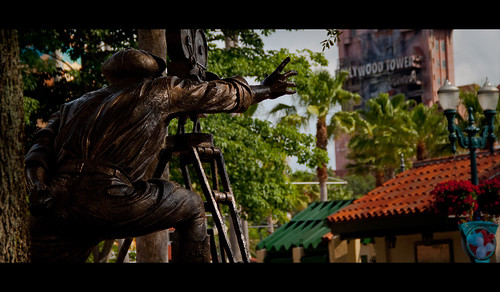
Alright… I’M DOING IT!!!!! I’m going with the Tower of Terror …. Heck, even “The Director” knows who the main star is. 😉 Although it’s location doesn’t make for the greatest icon, I think the ToT still represents the park well. It really fits with the movie studio/working set/golden age of Hollywood theme; which is one of the aspects I really enjoy about Hollywood Studios. The Chinese Theatre is too much a mock of the real Grauman’s Chinese Theatre; so I don’t it’s original enough. And I feel the hat is a little too Disney (as in too cheesy, cartoonish looking…. might as well put the Mickey hand and wand back on Spaceship Earth). But that’s my case, and I’m sort of sticking to it. 🙂
wonderful world of hilary:
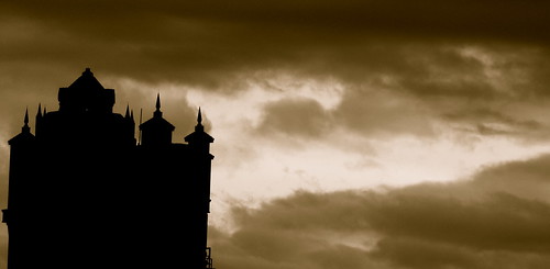
I’ve got to go with Tower of Terror. While I truly don’t believe it was ever supposed to be considered the park icon it has at least among the masses become the most recognizable structure in the park. The Sorcerer’s hat becomes a great way to give directions, the Chinese Theatre sadly goes unnoticed by many who don’t even know it is there and the water tower is only ever spotted when guests climb on board the backlot express. Yet the Tower of Terror is one of the first places guests literally run to and continually talk about throughout there trip.
EarFul Tower
Ralph.Anseus

My wife and I agree that The Studios should be working studios again. The EARful Tower is the icon for a working studio, not as commercial as the hat, and not trying to be something else like the ToT or Chinese theater. The tower is distinctive and classy.
Crossroads of the World
Matt Pasant:
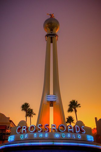
I love the Crossroads of the World. Mickey Mouse spinning atop the globe seen towering above the park from afar. It sets a distinct tone for the park.
Finally, Grauman’s Chinese Theatre
Roger Tiller:
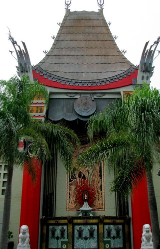
From the very beginning this was THE Studios icon for me. I don’t hate the hat, I think it looks great at night. But if you ask me what one icon represents the Studios best it’s the theater.
Cory Disbrow:
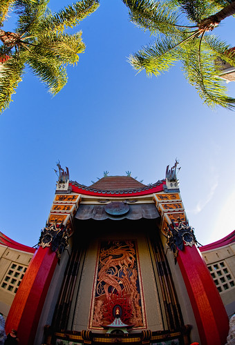
I’m somewhat surprised that not so many people have voted for the Chinese Theatre. It was the icon of the park in its original design, and when the park opened in 1989. The Chinese Theatre is a classic Hollywood icon, and with its architecture a perfect example of “A Hollywood that never was – and always will be.”
When I think of Hollywood (the real one), I see three icons: the HOLLYWOOD sign on the hill, the Capitol Records tower, and Grauman’s Chinese Theater.
dd_indy:
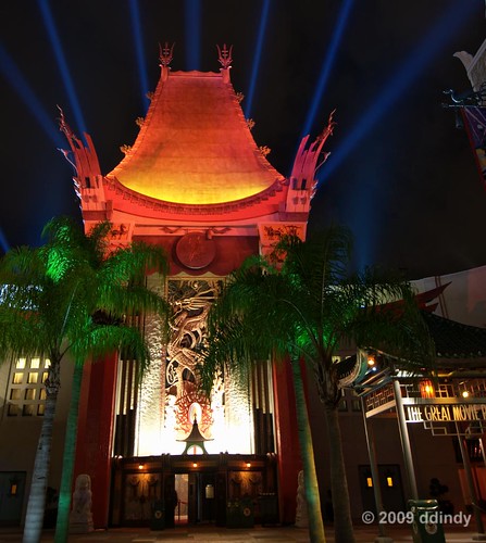
At Disney’s Hollywood studios, there are no hills to put a HOLLYWOOD sign on (although there is a billboard for the original Hollywoodland housing development) and nobody really wants a multistory office building in a theme park. (An abandoned hotel is acceptable, though.) That leaves Grauman’s Chinese Theater. It’s hard to tell now if it would work as a weenie, since the view is blocked by the hat. But to me, at least, the theater is the most iconic feature of the park that’s all about Hollywood and movies. The Earful Tower? I’m sure it was intended to be the park’s icon, and certainly was in the beginning, but to be honest, once I’m inside the park now, I don’t even see it. Let’s keep the hat, though. I recommend moving it to the south end of Streets of America – give the Backlot Tour trams something to drive around when they make that U-turn at the end of the tour. During the Holidays it can hold up the Peace On Earth globe for the Osborne Lights. And moving the hat is the first step in restoring that huge hidden Mickey in front of the Chinese Theater.
SpencerLynnProductions
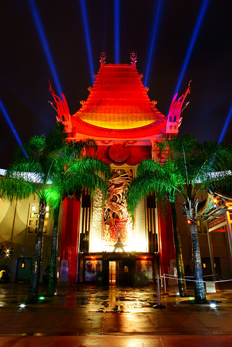
As per a Disney book I once read a park’s icon is referred is what should draw you into the park- keeping you perpetually motivated to not stop too soon. By that definition I’d say the Sorcerer’s Hat wins… but with that said, it’d be a lot easier to see the real icon of Hollywood if it were removed. The Chinese Theatre IS Hollywood- the classic handprints out front- the search lights emitting from its roof- you have to admit, even if you’re for the hat… THAT says Hollywood. The hat is ambiguous. For Disney it may represent the pinnacle of film (Fantasia) but the average person may not even be able to put the hat to movie especially with today’s kids… (and that’s coming from a kid) P.S. – also take into account how AWFUL the box office numbers for the new “Sorcerer’s Apprentice” movie turns out.
Finally, my entry and commentary:
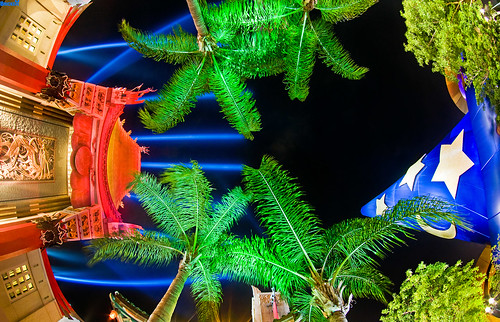
If ever there were symbolism underlying the relationship between structures, it’s between the Big Sorcerer’s Hat and Grauman’s Chinese Theatre. The relationship of these park icons mirrors the story featuring the hat, The Sorcerer’s Apprentice, quite closely. For those unfamiliar, in the now famous story, Mickey Mouse plays wizard Yen Sid’s lazy assistant who, out of the sight of his master, attempts to perform spells to dispense with his chores. To do so, Mickey dons the sorcerer’s hat and brings a broom to “life” through a spell to fetch water from a well and pouring it into a stone basin. While the broom is performing his work, he falls asleep to later awaken to find that the basin is overflowing while the broom is still filling it up. Mickey exacerbates the situation by grabbing an axe and chopping the broom to pieces, with each piece coming to life, forming hundreds of new brooms, and causing an even greater flood. Eventually, the master, Yen Sid, returns and calmly diffuses the situation.
Similarly, Grauman’s Theatre is the master and the Sorcerer’s Hat its apprentice. For years, Grauman’s Theatre had carefully represented the park and acted as its “weenie.” One day while its guard was down (likely for refurbishment), the Hat had the idea that it could help perform the task of the venerable Theatre and in doing so brand the park as “Disney” (for it felt this would alleviate undue confusion between Disney’s studio-oriented theme park and one a few miles down the road). It lazily summoned all of the spells it knew, and placed itself right in front of the Theatre. However, thematic and architectural disjointedness ensued, for the Hat had acted haphazardly, without consideration of how preempting the role of the Theatre may have its negative affects. To combat this, the Hat brought in a Pin Trading Store to occupy space below it, for everyone loved Pin Trading! This only exacerbated the problem, as the issues continued to build. Luckily, the Theatre returned to claim its rightful place and calmly diffused the situation by moving the Hat to the back of the park, where it acted as an identification that the park is a Disney product, and thus allowed the Theatre to be the fitting park weenie and Studios Icon (okay, this last portion of the story is still being written).
Okay, so perhaps I am overplaying my hand a bit with this allegory, but given the origins of the Hat, I think it’s fairly apt. I think my choice for Studios Icon is patently obvious: Grauman’s Chinese Theatre. It screams “Hollywood”, is attention grabbing, beautiful architecturally, and includes the Studios’ signature ride. To me, it’s the Studios’ SpaceShip Earth. The Hat is a mass of painted steel with a pin shop below it. Granted, it represents Disney well and does look pretty at night, but it just doesn’t pass muster.
Besides the Hat, Tower of Terror and the Earful Tower are the only other currently existing logical choices. In my opinion, Tower of Terror can be dismissed out of hand; the only reason it might be construed as Icon is because of its height. However, icon goes to representation of the park, not visibility (we’re not looking for “weenies”). I think it would be a stretch to say that, given the state of the Hollywood Tower Hotel in the Twilight Zone, it’s in any way representative of the general old-time Hollywood theme of the park.
Earful Tower is the only remaining choice. I actually think Earful makes a pretty compelling argument. Back in the pre-Hat days, Earful was often represented to the public in a capacity that, to me at least, said “icon”. It was featured on pins, various merchandise with the other icons, and promotional materials. Unsubstantiated claims indicate that this was due to licensing issues with Grauman’s (which is also the explanation proffered for the Hat being located directly in front of it); however, I have no idea if there is any veracity to those rumors. Presently, the Earful Tower is seldom seen by guests except for brief glimpses on the Tower of Terror, or if they make the mistake to board the heavily butchered Backlot Tour. Substantively, I think the Earful Tower would make a great choice, but I think it would require relocation or restoration of the Backlot Tour as one of the Studios’ premier attractions. Even then, I would give the edge to the Theatre by virtue of its location and due to it being a replica of one of the most venerable Hollywood symbols. However, as stated above in the allegory, this would require moving the Sorcerer’s Hat to the back or front of the park. Even then, I am sure the confusion and debate over the Studios Icon would rage on!
Next week’s Disney Debate subject of the Foto Face-off Friday returns to the normal “versus” format. Thrill junkies and trekkers alike love the Walt Disney World Mountain Range. This challenge features two especially thrilling summits, Big Thunder Mountain Railroad and Expedition Everest. Post a shot showing your favorite and explaining why it should be the “chosen one”! Please, help us settle the debate on Twitter by voicing your thoughts to @TouringPlans and entering your submissions in the TouringPlans Flickr Group discussion entitled “TouringPlans’ Foto Face-off Friday Blog – Big Thunder Mountain Railroad v. Expedition Everest!” You could have your comments and picture chosen to be featured in next week’s blog, so get to Tweetin’ and Postin’!


For me, during the early years of Disney/MGM Studios it was the Earful Tower. That’s the way WDI planned it. It was the only image used to identify the park. Today it’s got to be the hat. The most iconic image to my mind is the beautiful architectural rendering of the Crossroads of the World entrance structure. A design which by the way, has been replicated at the refurbished DCA. A true evocation of a time and place gone by.
It’s the theater. End of discussion. This is a ridiculous conversation.
I would suggest that the Sorcerer’s Hat is probably the best icon for the Studios park. It can be used on the trading pins, in Disney promotions, photos, etc. to represent the park (just like the Earful Tower used to be). BUT … I think the Hat should not be located where it is today at the end of Hollywood Boulevard. I’d like to see it moved, either to the Backlot, as Tom suggests, or to outside the entrance plaza. That would allow the Chinese Theater to again complete the illusion of the “Hollywood that never was and always will be” that the Imagineers originally intended. That big blue hat at the end of Hollywood Boulevard is just destroys any image of “Hollywood.” It doesn’t belong in that location, IMHO.
While I do not mind the hat (in fact, I LOVE the Socerer’s Apprentice), I do agree that it interupts the visual flow of the area. My problem with Grauman’s being the icon of the park is it’s not a Disney creation – the castle, SSE, and the tree of life all are. All of the souveniers from that park that I have collected over the years have the Earful Tower as the icon of the park. I would like to see them redesign or move the Earful Tower to make it a more definitive icon of the park. Great blog!! Thanks to everyone for the awesome photos!
My biggest complaint with the Studios flavor of Grauman’s Chinese Theater is how inaccurate it is, starting from the sidewalk: it’s missing the out of work actors in unlicensed superhero costumes begging for tips. 🙂
I made that point to a Cast Member once, and I got the most blank look I’ve ever seen.
…and Tom, your photo is one of the coolest compositions of that subject that I can imagine.
Something like this, or like this, with no cars, with distinctive Hollywood-type buildings on each side, and with the sign in the distance.
Now THAT would kick butt!
If you go to Hollywood itself there is no weenie except for the HOLLYWOOD sign, which is cool because you can see it from everywhere yet it is basically unreachable. None of the would-be or accidental weenies “work” in the DHS because if it’s going to give the atmosphere of the real place, it’s the HOLLYWOOD sign or it’s nothing.
The other distinctive things that really say “Hollywood” or at least “L.A.” are those super-tall skyduster palms a.k.a. Mexican Fan Palm a.k.a. Washington robusta. Do they grow well in Florida? I can’t remember seeing them at any of the theme parks. If DHS could build a boulevard lined with 50 skydusters and put a HOLLYWOOD sign in the (simulated) smoggy distance, that would absolutely scream “Hollywood” and would definitely be an inviting weenie to east-coast visitors.
This is the single best photo blog post ever. Nice job Tom!
Thanks, Matt!
I think as the world’s biggest fan of the Studios, you owe it to the people to give your take on the ‘true’ Icon of the park. Of course, maybe that would prejudice everyone else’s opinions too much!
the other idea would have been to make a giant star as an icon. A star would definitely have a hollywood feel to it and be appropriate.
Personally, I don’t see the Theater as an Icon for the park. With that said, the Hat was a good concept, executed poorly. If the hat were larger (yes larger), made of different building materials to give it a ‘life like’ look instead of a cartoonish look AND the hat were either an attraction or a restaurant. Personally, I think a restaurant modeled after the Animators Palate on DCL would be a perfect fit. The ground level could still be a retail shop, much like in teh Japan Pavillion.
The hat is a great tie to all things Mickey, Disney and hollywood but just not executed as a good final product.
Good points, but for me the biggest problem is how the hat destroys the architectural flow of the area. WDI did a great job with the initial design of the park carefully designing the building facades to look like “Old Hollywood” including the famous Grauman’s Chinese Theatre, which was the perfect culmination. No matter how well designed, a giant sorcerer hat is not going to fit that architectural scheme.
I think it represents one movie well, but there is little doubt to me that Hollywood’s most famous movie theatre represents Hollywood a lot better than one object from one film.
Personally, I don’t like the idea that every Icon must be branded with Mickey or Disney to fit in the parks. The Wand above SpaceShip Earth was a monstrosity, the Tree of Life looks splendid without Mickey shoes added to its roots, and I think we all can agree that Cinderella Castle should be left alone.
I do like your ideas, though, and think they’d work well for a re-located Sorcerer Hat.