Urban Design: Magic Kingdom’s Adventureland Part 2

Editor’s note: This is a guest post written by Sam Gennaway, an Urban Planner who runs the fantastic SamLand’s Disney Adventures blog. This is part five of the INTRODUCTION TO THE URBAN DESIGN SERIES of posts he’ll be contributing here. Sam visits Disneyland on a frequent basis and toured with the Unofficial Guide team on our recent Disneyland Trip. You can also follow Sam on twitter: @samlanddisney.
Time to complete our journey through the Magic Kingdom’s Adventureland. For more fun Disney stuff I invite you to visit samlanddisney.blogspot.com and see more about the design, history and touring tips for the North American parks.
My philosophy is that Urban Design is the process of creating places and policies that lead to environments that are alive, respect people, and have meaning. When the designer gets it right, that place exceeds in its performance to the relationship of its purpose. This series is where my interest in the Disney parks collides with my professional curiosity as an urban planner.
Last week we walked from the Hub and entered Adventureland. Today we will continue our journey with the hopes that we will be safe from singing birds, spitting camels, lions, tigers, and…well I guess there are no bears. But trust me, they are really, really close.
Once over the bridge, the path through Adventureland turns and meanders. You have buildings framing one side and the jungle and the Swiss Family Robinson Treehouse defining the other side. The use of forced perspective is used effectively throughout this area and really adds to mood.
To show you how concerned the Imagineers are with the details, a popular story in some of the books is how they dealt with what could be a visual contradiction of major proportions.
There is a tower on the building with the miserable Tiki Room show. At the top are heads of water buffaloes. This tower is also visible from Frontierland. From that side the heads appear to be bison and the primitive structure looks like something from the western plains. Very clever.
Through Disney magic you make your way out of the jungle and land in an Arabian Bazaar. At the center of this sub-district is the Magic Carpets of Aladdin. This Dumbo clone acts as a strong center element and is nicely supported by the little storefronts. The attraction is also a clever way to reuse old stuff. The camels spitting water are leftovers from a parade.
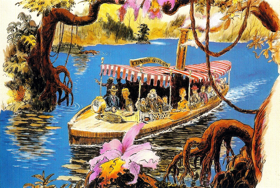
Your journey continues as we past by the Jungle Cruise. I like how the grade change between the main path as you head toward Pirates and the way to the Jungle Cruise makes the Family Swiss Robinson Treehouse look even more impressive. The lower level area also creates a well-defined and well themed waiting area for a very popular attraction.
But it is time to move along. And up ahead would be another wienie – the fortress from the Spanish Main. The plants go from being unrestrained to a more formal organization within planters. I have read many accounts on line to suggest this area has change greatly over the years. It sounds like the area was even more successful.
I do know that the whole Pirates of the Caribbean at the Magic Kingdom were an after thought. They didn’t plan on having this attraction in Florida. However, the demand was so strong after the opening of the park they caved in and killed what could have been a monumental attraction – Thunder Mesa and The Western River Expedition – and installed the Reader’s Digest version of Pirates of the Caribbean.
The plaza in front of Pirates of the Caribbean is consistent with the traditional element in most towns created during the great age of Spanish exploration. The Plaza is all hardscape holding back the jungle and sets the mood for the attraction. It also provides the functional benefit of comfortable and ample space for the queue.
Beyond Pirates is another clever example of that cinematic cross dissolve effect that creates a transformation from one themed land to another that we saw as we entered Adventureland.
Keep an eye on the buildings to your right on your way to Splash Mountain or Big Thunder Mountain Railroad. On the northwest side (Adventureland), the buildings reflect the Spanish architectural style found throughout the Caribbean. On the southwest side (Frontierland), the designers use the same architectural typological vocabulary and reinterprets them as Spanish influenced buildings that were typical of the America Southwest during the 1850s.
This use of accurate details may seem excessive but it achieves the “plausible impossible” and created the equivalent of a cross-dissolve transition from the jungles of Adventureland to the deserts of the American west. There are no visual contradictions that would spoil your journey.
Coming soon will be American history told in three dimensions Disney style – from Liberty Square to Frontierland.


Heya i am for the first time here. I found this board and I to find It truly helpful & it helped me out much. I hope to give something again and aid others such as you aided me.
WDW is filled with these little level changes. One of my favorites is very subtle yet very effective. As you enter the MK and AK you are forced to walk across a bridge on your way toward the weenie. Next time notice that the bridge is elevated. Also notice how many people stop on the bridge. This slight elevation change means you can look over the heads of others and get a clear shot of the view.
Sam
I never thought about the sunken area for the Jungle Cruise queue as making the Swiss Family Treehouse more impressive, but it totally makes sense. Neat!