WDW Attraction Wait Times: A Visual Representation
Last week I saw a nice data visualization of how COVID-19 compares to other causes of death in the United States. I looked into the tool that was used and decided to put some of our data into the Flourish data visualization tool.
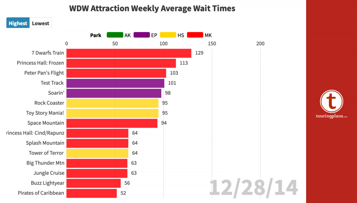
The chart below shows the weekly average wait times of Walt Disney World attractions. You can choose to see the top or bottom 15 attractions. You can include or exclude parks by clicking on the legend.
Flourish has many other templates. As I have the time I will work on other data visualizations. If you have and idea you would like for me to try let me know in the comments.


Love this!
Very cool!
Some folks seem to be missing that you can move the timeline on the bottom of the chart, spanning the end of 2014 and the beginning of 2020.
Great idea but it would be better if the video was slowed down a bit to help see what’s happening. Looks a little chaotic at the moment.
Interesting. I’ve been debating whether a June or July trip would be best when things get back to normal (likely not this year). This visual shows that wait times the past three years were shorter in June than July even when ignoring the week of July 4 each year. Excellent work!
He used all data from 2014 until February of this year. The loop that you can play with this data is the point of the tool. Press play on the chart, and you can see it in action.
It appears that the data used is from 2014 which is prior to the opening of either ride. I think this would have been more useful if he had used data from last year.
Why are there no Pandora or Galaxy’s edge rides on the chart?
This is more about the Covid example, but what is the data source? It’s a cool visual but no idea how good the data is.