Does a Longer Wait = Higher Satisfaction?
A few months ago, I did a generic correlation of average wait times to overall satisfaction for all attractions over the past three years. (You can read about the full results of that study here.) But I was very clear in that analysis that these were overall averages. So they represent a really wide view of what’s happening. But wouldn’t it be cool if we got to more specific detail? Like if we could figure out based on wait time data and survey data how long you waited, and what your exact satisfaction was given your exact wait time.

Oh hey! We have all that data and we can tie it together. I’ll be honest – the results here didn’t turn out the way I expected. My plan was to figure out, for each attraction, what the “break point” was for satisfaction. For example, at a 20 minute wait maybe EVERYONE loves Space Mountain. But once you get above that, satisfaction starts decreasing with your increased wait. I didn’t really find those breaking points, but what I found can still be informative.
Explain the Math!
TouringPlans users submit wait times through the Lines App (and if you don’t, you should – more numbers to crunch = more accurate predictions for your next visit). They can also complete a post-visit survey where they tell us how satisfying each attraction was on a scale of 1 to 5. Tying these two datasets together is where it gets tricky, but we can do it by taking the following steps:
- The user has to match between the survey result and the submitted wait time
- The attraction has to match between the survey result and the submitted wait time
- The day the wait was timed has to fall between the start date and end date of the visit that the survey was about
And I actually took it one step further to make sure I didn’t muddy up the data. If the same user submitted multiple waits for the same ride during the same trip, I threw those out. We only have one attraction satisfaction rating, and I didn’t want to average out the wait times or do some other sort of aggregation. So I only pulled satisfaction scores for each attraction that met the above criteria and only had one wait time.
I only pulled wait times and surveys from the beginning of 2019 through July 2021. Even still, I had a sample size of over 7,750 different wait times that attraction satisfaction scores directly associated with them. Yay! That’s a decent sample. Bonus – each wait time could have more than one satisfaction score associated with it, because we stratify satisfaction by age group. So I can treat each wait-satisfaction pair as independent. Maybe grade schoolers have a different “break point” than “young adults”, or maybe they don’t. I can keep that information stored and see if it makes a difference. But now I have over 15,400 independent pairs in my sample.
Park-Wide Results Example: Magic Kingdom
 Hold. The. Phone. Do you see what I see? Those green sections are getting bigger as the wait goes up! Does that mean I’m going to be happier if I wait longer? Slow your roll, let’s talk about it.
First, let’s figure out all of the crazy happening in this graph. The grayed out section to the far right shows that we don’t have enough wait times in those bins to make it a good sample, statistically. All of the other colors’ columns are standardized in height, and then the colors show what percentage of results were rated a 5, 4, 3, 2 or 1 in satisfaction. So more green = happier people. The black line with dots shows the overall average satisfaction score within each bin – the values for that line are over on the axis to the right.
So what I’m seeing here is that average satisfaction is, in fact, increasing with wait time. I can tell that by looking at the black bar, and by looking at each column and seeing more and more green as the wait times increase. Does that mean I can just plop a headline like “Who Needs To Plan? Wait Longer, Be Happier” on this graph and call it a day?

Nononono. The problem here is that my sample is at the wrong level. To the right you’ll see the average wait/satisfaction graph from my post 3 months ago. It’s a little itty-bitty, but we don’t need the details to see the trend. Across all WDW parks, if I was to eyeball a trendline for all of the colored dots, it would start near the bottom left and end near the top right. What does that mean? It means that attractions with higher satisfaction tend to have longer waits. So if all I’m doing is plotting wait time vs satisfaction for an entire park, yeah, it’s going to show that longer waits are more satisfying. Because those rides are more popular, and attract bigger crowds, and therefore you’ll wait longer for them. You expect it. You still enjoy the headliners. And the walk-ons might not be as satisfying, and that’s why they’re walk-ons.
Well, phooie. Okay, so the big fancy graph above tells me … that higher-satisfaction rides generally require longer waits. And I guess it shows that I can’t make some generic statement like “If any line at Magic Kingdom is longer than 20 minutes, you will be less satisfied”. But can I get more detailed information? My next step was to narrow to a specific attraction to see if the “break point” was visible at that level. I ran these graphs for a LOT of different attractions, and they pretty much always fell into two different “types”. Let’s explore each one separately.
Type 1: Always Awesome No Matter What
This attraction type is basically your headliners. They’re great rides that almost everyone enjoys, and it doesn’t really matter how long you wait, they’re still going to be fun. In fact, some of them even appear to increase in satisfaction as the wait gets longer. Let’s look at one example of this type of attraction from each park.
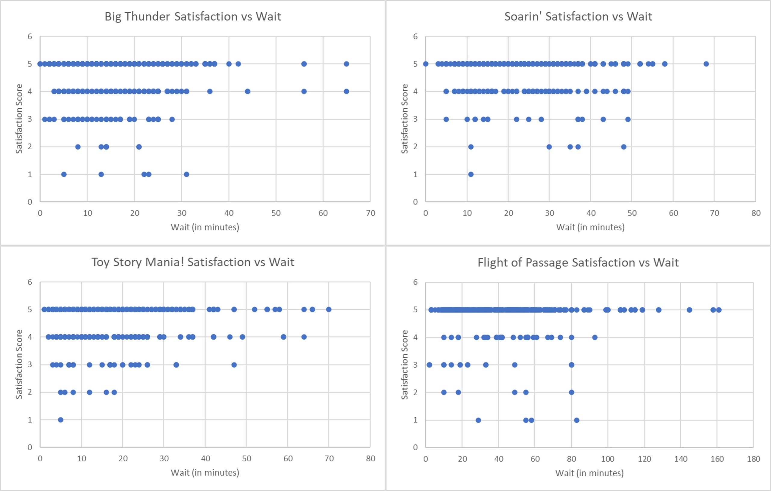
So what do you think is going on here? Are people really happier to wait longer for Toy Story Mania!? I think we can all agree that logically that doesn’t make sense. What is probably really happening behind the data is that we have some selection bias. You’re probably not going to get in an hour-long line for Toy Story Mania! unless you already know that you just LOVE that ride. If you’re unsure, or you’re unsatisfied because you keep getting outscored by your young child, you probably won’t even bother joining the queue if its lengthy. Knowing all of that, it’s not particularly surprising that there’s no breaking point in satisfaction here. These are big, popular headliners. They have high satisfaction no matter the wait.
Type 2: You Like It, Or You Don’t
The non-headliners, or less-popular attractions are where I would expect to see a decrease in satisfaction after a certain amount of time. Yeah, Na’vi River Journey is cool if I wait less than 10 minutes. After that though … I’d probably be less happy.
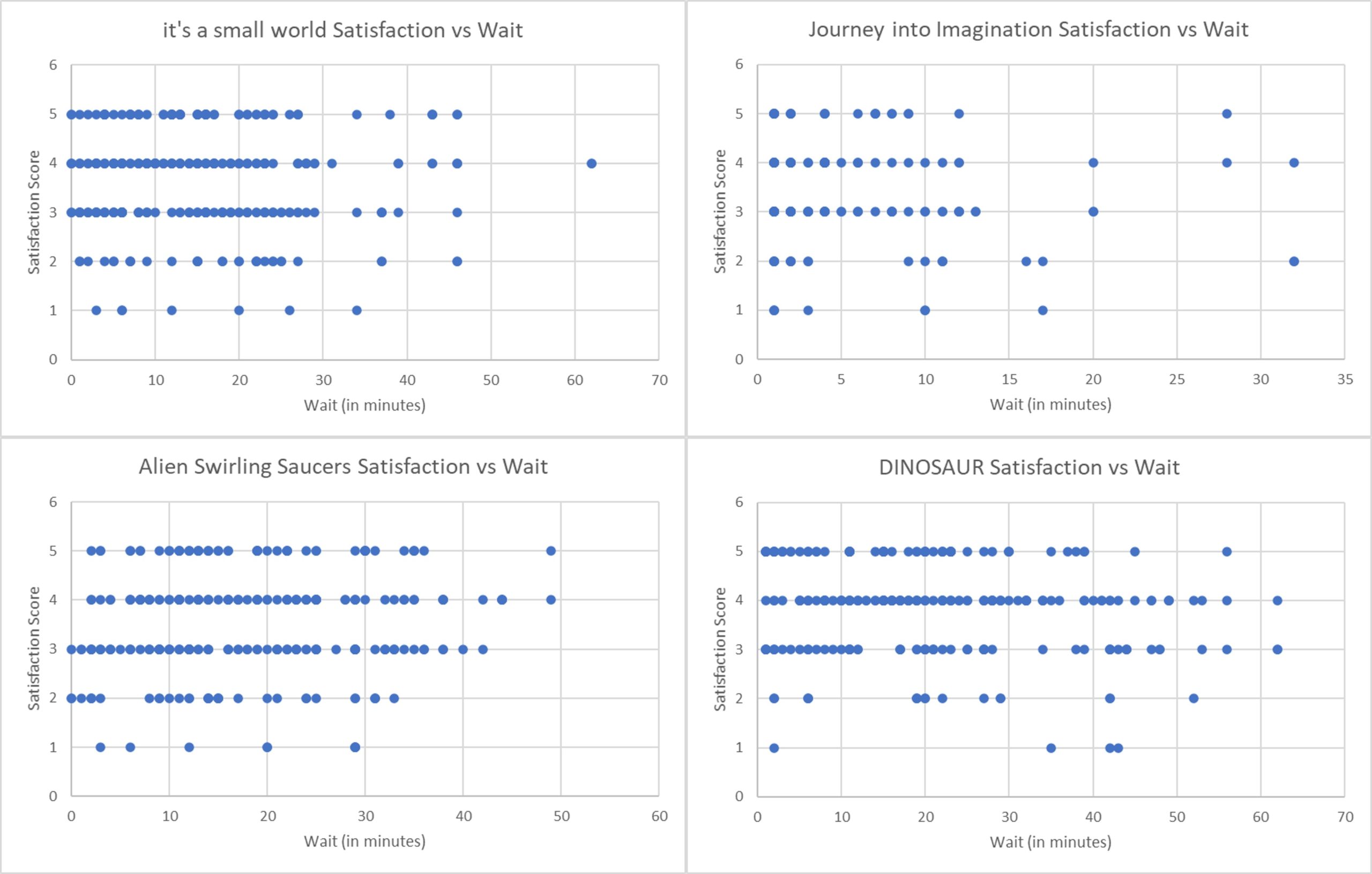
But it looks like that’s not what really happens. Even at really short waits, there are people that just aren’t impressed. And the proportion of people that aren’t impressed stays pretty much the same no matter the wait. So it’s possible that satisfaction with an attraction is only impacted by ride quality, and not by wait experience. But we also know that our selection bias problem is still here. Experienced folks that know whether they like the ride or not will balk before getting in line, so we won’t get a wait/satisfaction from them unless they’ve already pre-determined that they like the ride. So our proportion of highly satisfied folks at higher rates is likely not accurately reflecting reality.
What Does That Mean For You?
- Here’s where I was going to helpfully tell you wat what point you should bail on lines for each ride. But it turns out we don’t have that information!
- Instead, this is a good lesson in the difference between data and information, which is … context! Our data here is right, but we could easily infer incorrect information. Thankfully, we took a step back to understand what was really happening.
Do you have any personal breaking points for attractions? Do you remember the longest you ever waited for a ride, and what you think your satisfaction was?

You May Also Like...
-

You know how some things are just better together? Wanda? Pretty cool. Vision? Adorable. WandaVision? I would watch that every day…
-

Last week I saw a nice data visualization of how COVID-19 compares to other causes of death in the United States.…
-

A trip to Walt Disney World isn't complete without visiting the mouse that started it all! Meeting Mickey is an essential…
-

Food at Walt Disney World is expensive--especially the food at table service restaurants. I've researched plenty of meal hacks and hidden…
Will suggested Touring Plans be available for each of the parks now that Genie, Genie +, ILL and Early Park Entry have replaced fast pass and magic hours?
I tend to agree with Lydia: Thanks to Touring Plans / Lines , we have so much information to assist with Park visits that we can make better decisions before getting in any line. If we are tuned into Lines enough to be giving Wait Times, then more than likely we have already made decisions about that line before we began reporting the Wait Times.
Oh well, only the data nerds are still reading at this point and we love these kind of posts, so keep them coming. Satisfaction=5
Some rides are “worth the wait” but, because there are known times the lines are short, it’s “not worth the wait.”
Spaceship Earth, as an example, has a lot to offer, but I will bail if the line is longer than 10 minutes. Why? Because I know that there are plenty of times (not first thing in the morning) that the line is under 10 minutes. I don’t think I’ve ever ridden it when I waited more than 5 minutes.
By the way, I’m currently planning a trip, and I’ll give Figment 1 minute, tops. I guess that doesn’t help your data, though. Chalk that up to anecdotal
Lydia, what a great point! Relative bail-out points. I hadn’t considered that, but you’re right. My bail-out point is definitely impacted by how frequently I visit and know about wait patterns and expect to be able to wait at some other time (whether later that same day, or on a subsequent trip).
Yet again: *loving* this type of analysis!
Okay, thinking out loud here: it sounds like you need to find a way to normalize the reported satisfaction rate to control for the fact that some attractions are simply more satisfying to users than others. If you could do that, then you might be able to identify differences in attraction ratings that result from differing wait times.
Would something like identifying the median satisfaction rate for each attraction, then comparing the reported rates by wait time do it? If you know that Space Mountain has a median satisfaction rate of 4.0, could you subtract that from reported ratings, then look at the correlated wait times? Maybe short waits at Space Mountain would be correlated with more 5.0 ratings, so the difference would be positive, while longer wait times are more likely to hit 4.0, and extremely long wait times would be lower, and the difference would be negative? (At least, that’d be my hypothesis).
That still doesn’t solve the selection problem you identified above, and of course, you may well have just wanted to illustrate the dangers of analysis without context! Apologies if I’m way off base, and looking forward to your next post!
Oooh, look at you with the solutioning. I love it. Normalization would totally be a valid next step if we wanted the park-wide analysis to be more accurate. But you’re right, it still doesn’t account for the selection bias I talked about. I hadn’t considered totally removing the median from the equation … in almost all cases the median is still 5, no matter the ride or the wait duration. I bet it would produce some interesting results.
Another tactic is comparing the same “person” (user/party) on different trips. That way we still have a 1:1 wait:satisfaction comparison, but with two different wait times and two different satisfaction scores from the same user. We take out selection bias that way because it’s the same person and we can directly see how their satisfaction changed (or if it didn’t) as a result of differing wait. Unfortunately, there just aren’t enough repeats within the past few years to have a good sample size to make that analysis.
To be honest, I was kind of expecting a reverse trend. “Because I waited so long for it, it must have been worth it, (why else would I wait?) and therefore my satisfaction is higher.” There is evidence of this sort of subconscious bias (I worked harder to get it, therefore it must be more valuable) in other situations so I thought it might show up here.
Ooh, interesting perspective, Peter. I can understand where you’re coming from. I think it may just be a personal psychological difference. Like an optimism/pessimism thing. My husband would tell you that if everyone hypes up how awesome a movie is, he’s much less likely to enjoy it because he expects so much. Similar with rides – if everyone loves it and it therefore has a much longer wait, he probably tends to be underwhelmed with the result. I like your “wait optimism” 🙂
We know Disney will inflate wait times to push people away from an attraction. That means you have the data to find the breakpoint at which people will choose not to queue for a ride due to the perceived wait time, it’s in the divergence of posted wait time from actual wait time. Don’t know if we have the data to know how *many* people are turned away by an inflation of a certain size but perhaps we could work off a verifiable assumption such as “Disney tries to keep the queue at max length X” or “Disney tries to keep the max actual wait at X” then see if that appears to be their strategy. If so we can solve for how many people they are trying to turn away by inflating the queue time. This could be confounded by them messing with wait times for other reasons like temporary issues that affect capacity but aren’t long lasting enough to remove the wait time from the list.
It would be interesting to look at the tp satisfaction ratings vs divergence of posted and actual wait times. Is there a correlation between how much a rider beats the posted wait time and satisfaction? If the number of guests turned away can be figured, the satisfaction breakpoint can probably be figured too.
Name for this is cognitive dissonance. Had to chime in as I teach Social Psychology.