
How Do We Measure Walt Disney World Resort Quality?
Subtitle: Being picky with data
Alternate subtitle: Data doesn’t lie, but it can tell different stories
Data can be tricky. Even answering simple questions requires making decisions about what numbers to use and what to ignore. Or who to ask, or how to ask. A million little choices add up to one headline you might see or one piece of information that influences what you think or how you act. That’s true for all data, so that means it’s true for the data that we use and show at TouringPlans too.
So today I’m doing something a little different and walking you through my thought process on how to answer a single question – the choices that I make, and what those choices mean for the end result. I’ll help you learn how to be a savvy consumer of data. Today’s question is all about quality at WDW resorts.
Explain the Math!
Lucky you, this post is all math. But I’m limiting our inputs. In this case, we’re only going to look at results from the WDW post-visit survey that anyone can fill out after they vacation at Disney World. And I’m not going to dive into details of different facets of satisfaction, like the best pool or friendliest staff.
I also don’t really care about how your resort impacts other aspects of your vacation. It might be interesting to see how your resort impacts where you eat or what attractions you experience and how satisfied you are with those. But I want to narrow our scope. Just resort data.
See how many decisions I’m already making? Taking all of those constraints, I’m left with three different questions on the post-visit survey that can tell me about resort quality:
- Please select the text that best describes your satisfaction with your total hotel/resort experience during this trip. (Very Dissatisfied, Somewhat Dissatisfied, Neither Satisfied Nor Dissatisfied, Somewhat Satisfied, Very Satisfied)
- Would you stay at this resort/hotel again? (Yes/No)
- How likely are you to recommend this resort/hotel to a friend? (Definitely Will Not Recommend, Probably Won’t Recommend, Neutral, May Recommend, Will Definitely Recommend)
I can convert each of the results to a 1-to-5 scale so I can do some statistical analysis with it. This is a little bit of cheating on the Yes/No where No becomes 1 and Yes becomes 5 (typically I’d go with 0 and 1 instead of 1 and 5), but it allows me to directly compare each of the three questions and their results.
Dataset 1: Overall Resort Satisfaction
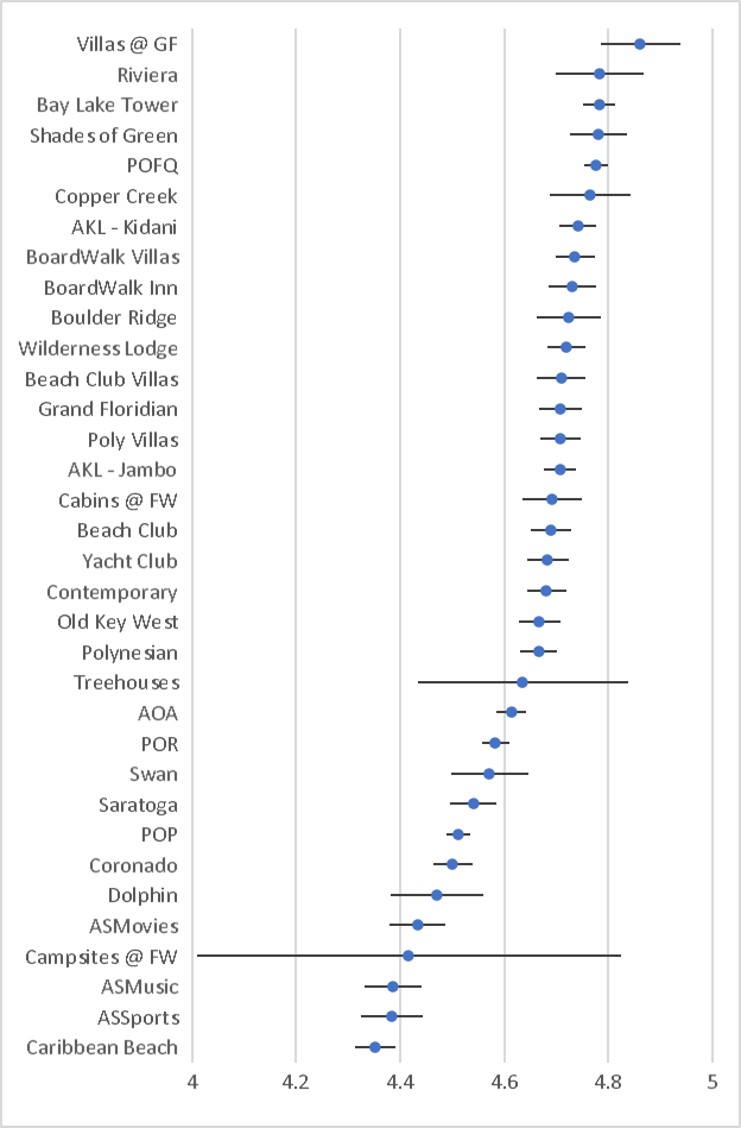
Pop quiz! What choices have I already made in this visualization that could tell you a different story than if you had all of the raw data?
- I chose average – not median, not any other statistic of my choosing. So any really high or really low numbers could technically influence the results here.
- I showed you 95% confidence intervals. I could have left those off and just given you averages and you wouldn’t know if there was a lot of variance in the responses or not.
- I zoomed in the x-axis to go from 4 to 5. If I left it 1 to 5, all of those differences between resorts would look tiny and tell a different story (“Hey, all resorts at WDW are pretty stinking satisfactory”).
- I didn’t tell you when the data is from. Since I didn’t, it’s probably safe to assume that these are all surveys from the history of ever – which, in this case they are. But that means Caribbean Beach might be at the bottom because people hated it before a renovation or the opening of the Skyliner. Maybe.
Thanks to all of those choices I made and now talked about transparently, we can figure out some things.
- The Villas at Grand Floridian have the overall highest satisfaction, but its confidence interval overlaps with the confidence intervals from 7 other resorts. So statistically speaking, any of those 7 resorts could potentially also be the most satisfying, according to this question.
- The confidence intervals for the Treehouses and Campsites are totally giant compared to all others. Without more information, you wouldn’t know if that was because people had vastly different experiences or if the sample sizes are just low (both things that impact that confidence interval). So I’ll go ahead and tell you that it’s mostly because of small sample size.
- 22 out of the 34 resorts (~65%) have an average score that lands in between 4.6 and 4.8. That means as long as I’m good with being halfway between “Somewhat Satisfied” and “Very Satisfied”, I have a lot of options.

Ooh, I switched it up. Now I made all of the same choices – except for one. Timeframe. This time I’m only pulling surveys from trips in the past 3 years. I typically would’ve gone with 2 years because that would give me big enough sample size to have tight confidence intervals. But quite a few WDW resorts have been closed for more than half of the past 2 years, and I decided that wasn’t fair. So what’s different here?
- Compared to the original graph, the Treehouses appear much higher on the list, and Riviera and Kidani both drop quite a few spots.
- Overall, confidence intervals are wider. That makes sense – fewer surveys = smaller sample size = wider confidence interval.
- In the past 3 years, three resorts break out of that 4.6-4.8 range that we saw in the previous graph.
If I had only shown you the second graph without the first (or vice versa), might you have assumed different things or made different decisions about where to stay?
Dataset 2: Would You Stay Again?

Now we’re addressing our question a slightly different way. Perhaps the highest-quality resorts are the ones where you’d most want to stay again after staying there once.
- Confidence intervals are bigger here than in dataset one. But that’s because all answers are either 1 or 5, so the variance is going to be higher than when 1, 2, 3, 4, and 5 are all options.
- Both AKL resorts drop significantly on this graph compared to dataset one. So if I only showed you this graph, you might assume they are lower quality. But if I only showed you the previous one, you might assume they were higher quality. Combining the two results tells me that the resorts are satisfactory, but may be more of a one-and-done for most visitors compared to other resorts.
- Swan and Dolphin are both significantly higher on this graph compared to dataset one. So their satisfaction is lower, but repeatability is higher. For those reports, visitors may just accept what they’re getting (on-property perks for Marriott prices … or points) and be willing to stay again even with relative lower satisfaction.

- In just the past 3 years, the Villas at Grand Floridian move back up into almost the top spot, and for the first time, Caribbean Beach isn’t at the bottom! Maybe the Skyliner reopening really did make some impact.
- If I saw just this graph, the biggest surprise to me would be the Swan. If you had asked me to pick a set of top 10 resorts for repeatability … the Swan wouldn’t have been on it. Of course, I also wouldn’t have put Animal Kingdom Lodge in the bottom half.
Dataset 3: Would You Recommend?

Our final perspective on our resort quality question comes from whether visitors would recommend the resort to a friend. Interestingly, results here are numerically the lowest. So, regardless of whether you were satisfied or would stay there again, you tend to be more hesitant to recommend something.
- Recommendation has a much bigger spread than satisfaction – the difference from the top to the bottom average is 0.73 (compared to 0.51 for satisfaction). If I want to emphasize differences between resorts, this might be the result set I would choose to display.
- When I look at this graph compared to the previous ones, Riviera and its relatively low position jumps out at me. It was #2 in satisfaction and #8 in staying again, but down at #13 for recommending it.
- The Villas at Grand Floridian have a pretty wide confidence interval for this dataset. Since the sample sizes are the same between all three datasets, that means that responses were more varied for this question than the others. Port Orleans – French Quarter is right behind it with a very small confidence interval – lots of similar responses.

- In the past 3 years, responses at the Villas at Grand Floridian have trended higher, even though the confidence interval is still wide-ish (that’s the technical term).
- Compared to the all-time results, Art of Animation now rates as the most-recommended Value resort instead of Pop Century.
- Interestingly, the Treehouses are much higher in the past 3 years than all-time. But the confidence interval is so wide, statistically we could expect to find them in almost any spot on the list from bottom to top.
What Does This Mean For You?
- There are many decisions being made behind the scenes before any data or information is displayed to you. Train yourself to be a wise data consumer by trying to figure out what those decisions were and why they were made.
- The data that you don’t see is often as important as the data you do. Use a critical eye when looking at graphs or reading about results.
- There are frequently multiple ways to answer any question, even if we’re talking about something as specific as resort quality. It’s my job to comb through the data to tell you an accurate, reliable and informative story. It’s your job to hold me accountable and help provide different perspectives on new ways to answer questions.
Did the different facets of resort quality give you any new information? Were you interested by how any of the resorts moved up and down between datasets or in different timeframes? Let us know in the comments!

You May Also Like...
-

October 1 will be the kick-off of not only new fireworks shows, daytime shows, cavalcades, new attractions, and more. In addition,…
-

Today, the Walt Disney World Resort shared that a number of their hotels will be delayed in reopening. The reopening dates…
-

Breakfast. It's the most important meal of the day! Arguably it is even more so at Walt Disney World where you…
-

Choosing where you want to stay for your Disney vacation can be difficult. After all, there are hundreds of resorts in…
Loved every word of this.
Interesting. Looks like the military like SoG. Will be staying there on my next trip.
Ah! Ray, I’m glad you commented on that because I meant to say something in the article. Typically I leave out Shades of Green because you either can stay there, or you can’t, so it’s not a decision point for average users. But I think it’s great to see that it’s one of the most satisfying resorts. I hope you enjoy your stay!
Interesting article.
It might be interesting to see a scatter graph, with something like Dataset 3 values on the y-axis, and average price (or a log version) on the x-axis, and see if there are any outliers that way.