
SATURDAY SIX Artist Spotlight: The Theme Park Artwork of Charlie MacWilliams (Muppets, Mashups, Country Bears and MORE!)
This week the SATURDAY SIX Proudly Presents: The Theme Park Artwork of CHARLIE MacWILLIAMS! Over the years in this fine blog series we have taken the time to appreciate artists in the community whose work uses characters, attractions, or any other part of the Disney or Universal theme parks. In the past we’ve been able to shine a spotlight on talented artists including Rob Yeo, Phillip Weatherford, and Henry Taylor, while today we take a look at an artist whose love for the Country Bears rivals TouringPlans’ own Guy Selga….
***
Howdy, folks! My name is Charlie MacWilliams. I’m an animator and designer living up in Massachusetts, where I teach college classes on Animation and Character Design and work remotely for both the YouTube channel CircleToonsHD, and more relevantly to this website, the theme park news site WDWNT.

I’ve always enjoyed theme parks, having grown up in a family that went to Disney every few years, but that enjoyment turned into a passion back at the start of 2018. I took my first ever trip to Orlando with my then-girlfriend (now-wife!), Emily. After a week at Disney and Universal, I came back home with a new fascination for theme parks. Emily, on the other hand, came back with a fear of Wendell from the Country Bear Jamboree.
My journey into the world of theme park fandom started by spending all my free time between college classes binging channels like Defunctland and TPMVids, reading up on the history of the parks, and trying to understand what made these parks so, for lack of a better word, magical. After graduating from college in the Spring of 2020 (a wonderful time to be thrust into the working world), I began working on animated series such as Inside Job on Netflix and Apple’s Harriet the Spy.
After the Covid animation boom dried up, I spent a lot of time between jobs, struggling to find something that’d last for more than a few weeks. In the Fall of 2023, I was watching the latest episode of WDW News Today, when Tom Corless mentioned they were looking to hire graphic designers. One email and a phone call later, I was brought onto the team to do thumbnails, video editing, and artwork for their weekly comedy show WDW News Tonight. Over time, I’ve gone from part-time to full-time, and have done artwork for special events, merchandise, and a lot of other fun projects. It is definitely fulfilling to be able to combine two passions of my life into a career!
# 6 – Video Games
One of the perks of my job is essentially being paid to do fanart of the park. Doing art for a living often leaves me filling my free time with other activities like gardening or video games, so my collection of theme park art would be a lot smaller if it weren’t for the fact it’s my job now!
Over the last two years with WDWNT, I’ve done a lot of artwork for News Tonight, and a big recurring theme is video games. If I had the knowledge for coding, I’d love to make video games as the medium is so ripe for creating immersive worlds and telling stories that the audience can interact with. That’s pretty much the same reason I love theme parks, so it’s a natural fit to combine the two!
When I saw the announcement for “Super Mario Party Jamboree” on News Tonight, my mind instantly went to the Country Bears, and so I pitched the idea to the show’s crew for a weekly video game segment. The visual of Henry with Tanooki Mario on his hat in place of Sammy was too good to pass up.

The actual artwork for Super Mario Party Country Bear Jamboree ended up being one of my favorite things I’ve ever done. Not just because I got to draw the Country Bears (you’re going to notice a recurring theme with them in a lot of my art), but also because I’m also a huge Super Mario fan.

I’ve done a wide range of these faux game covers for the show. These include bits parodying current events at the parks (such as the Epic Mickey 3 cover finished practically before they got Mark Twain’s head back on right!) to bits that revolve entirely around puns or wordplay (such as Super Splash Bros for Super Smash Bros.) Hey, any excuse to draw Big Al is ok in my book!

My favorite out of all of the hand-drawn game parodies though is “Metroid Prime Time Cafe.” For this one I took the opportunity to create a design for Samus that evoked the illustrative style of the 1950s. I spent a lot of time researching various illustrations to break down the style into some of it’s most common traits: sharp angles, solid teeth smiles, outlineless eyes, and lots of pearl necklaces. While the colors are more modern to help make it clear that this is Samus, I think the general design came out nicely. Turning Samus’ arm cannon into a milkshake blender seemed like a great touch to me, and I’d imagine it would also work well in combat!

My video game mashups aren’t just limited to work, as just recently I had the idea of recreating the iconic Sonic Adventure 2 box art with Duffy the Disney Bear and Epic Universe’s Captain Cacao. It’s almost too perfect of a pairing to not do something with! Much like with the Samus piece, I spent a lot of time trying to perfectly match a specific style, this time being that Sonic artwork. The biggest challenge with it was all the gradients used in the solid fills- it took way longer than you’d expect. But the results speak for themselves, I’d say!

# 5 – Mashups
The mashups don’t just include video games, as for this piece, I parodied Hulu’s The Bear with… well, The Mouse! This one is pretty simple, but I had a lot of fun trying to pair characters from the show with Disney universe characters. While Donald as hot head Richie was a no brainer, I was going off vibes for using characters like Daisy Duck for Carmy’s sister Natalie. A detail that I doubt most people would be able to notice with all the characters blocking the background is that I actually used a picture of downtown Orlando in place of the Chicago picture in the original. I like to do little details like that, even if they go relatively unnoticed as it makes the process more fun for me.

Speaking of fun, this piece parodying Oppenheimer is hinging on a pun so stupid and ridiculous that it’s almost genius. While this is a straight Photoshop job rather than a hand drawn illustration, I think it still came out really nice. You’d be surprised at how long it takes to Photoshop a Swedish meatball to have the same lighting as an atom bomb. In the words of the Swedish Chef- “Noo I am become Death, the destroyer of worlds.”Nøø erma becøømenn deadden, der deströyener urv vörldsen!”

For one last movie mashup, we have Five Nights at Freddy’s mashed up with The Country Bear Jamboree! In a weird sorta way, this is a full circle piece as the Country Bears inspired the restaurant chain Chuck E Cheese, which itself inspired Five Nights at Freddy’s, and now FNaF inspired this piece featuring the Country Bears. We’ve gone from one top hat wearing brown bear to another!

The next two drawings are from a series of Epic Universe parody portals we did. First up is a Steamboat Willie portal…

…along with a DC Comics portal.

This one’s a bit more personal. A few years ago I did this little mashup of the iconic Haunted Mansion attraction poster with some old original characters of mine. This trio are from my college thesis film, Skeeto in: Sun Blocked. This was an animated short about a mosquito, Skeeto, trying to paint the sunset but a rude toad keeps blocking his view, causing Skeeto and his friends, Bogart (the frog) and Gumbo (the alligator), to get up to various slapstick antics to get the toad out of the way before the sun sets. My senior year of college was 2020, so due to specific global events at the time, the film was never finished, but hopefully someday it will be!

# 4 – WDWNT
As I previously mentioned, I’ve been working at WDWNT as a member of the graphics team since 2023. While I do plenty of thumbnails and the aforementioned comedy bits for the night show, I’ve also done a whole bunch of special projects!
My first big project after being hired was designing a new logo for the revival of the WDWNT Podcast. I started out by doing a bunch of thumbnail designs (the left side of the artwork below), using the company’s logo colors and iconography to create something that is in-line with their branding but still unique. The first version was pretty basic, just the logo with a banner reading “podcast”, but after that I tried out some more unique designs utilizing the globe symbol that their logo features. After some favorites from that first batch were chosen, I did some variations of them (the right side). I played around with how the red ribbon could be used to accent the blue and white logo, and eventually settled on the idea of it wrapping around the globe.

Out of those final options we ended up going with 3B, and once it was cleaned up, it looked pretty sharp. I also animated it for the intro to the podcast, having the globe “rotate” to reveal the text (in reality, it’s actually the text being manipulated to appear like the globe is spinning to reveal it) and then the red ribbon flying across the screen to wrap around it. This might be a bit esoteric, the red ribbon also served as a way to hide some animation wizardry. Because when it covers the screen, the logo with the rotating text is swapped out for a flat 2D image of the logo without the ribbon, so everything is lined up correctly and the ribbon can “wrap” around it without the layers getting all messed up. I’m a 2D animator by trade, so whenever I have to make things appear 3D, I use a lot of tricks to get it all to work!

Another project I worked on was designing the logo for our Promising Tomorrows event that WDWNT held earlier this year for both the 50th anniversary of Space Mountain and the 30th anniversary of New Tomorrowland. My first thought for a logo was something representing the unique nighttime colors of New Tomorrowland…the vast assortment of colors that give the land a very distinctly 90s sci-fi feel. As someone who loves theme park original characters, I also wanted to include some of the icons of the New Tomorrowland era including Sonny Eclipse, The Timekeeper, the Extra-Terror-estrial Alien, the News Robot, John Carousel, and – of course – Skippy! The characters are featured in profile under Space Mountain, and the gear and text are designed after some old New Tomorrowland signage. I love me some Art Deco font!

For the final version, I moved the Alien to the top taking a bite out of the gear, and in its place, I put the Hair Salon Lady from the PeopleMover to get that attraction represented. I really love how this came out, and the animated version especially looks nice, with the gear spinning and the Alien popping up to take bites.
![]()
For Promising Tomorrows, I also designed some merch. The first of which is a button up, which ended up facing some delays and just released at Carousel of Products! The shirt celebrates every iteration of Space Mountain throughout all the Disney parks in the world, not just the original in Florida. I started with the image below as a test for what the mountains would look like, but I wasn’t huge on it. The flat colors and more realistic design would prove to be hard to get looking right and the later mountains would be way too hard to do, so I knew my follow up design would use a simpler style.

In the next pass, I drew simpler stylizations of the mountains, but still used accurate colors.

Eventually I decided on going for a more retro style inspired by UPA artwork and general atomic age visuals. While that particular style is a bit older than the OG Space Mountain, I felt it worked well for a vintage sci-fi piece. I gave each mountain a unique color that I felt fit the best, which helps with differentiating the three original mountains.

With the final designs of the mountains settled, I added background details to fill the space. I also brightened up Paris’ Space Mountain, as the color wasn’t working well for the manufacturer. I think the bright red looks a lot better, and overall I really love how this came out.


Also for Promising Tomorrows, I made a Skippy magnet. I wanted to design something that felt like the kind of promo art you’d see in real parks merch. The best part of this to me though is that I have one in my office autographed by the Disney Imagineers who designed Skippy! So cool. I hope we get to see this guy come back someday.

In between events, I was tasked with designing the new company birthday card, featuring all our favorite park characters celebrating! The little Waldo here would soon prove to be foreshadowing for my next project.

This next piece is pretty timely. If you’re reading this the day it is published, June 7th, then it’s the last day of Muppet*Vision 3D being in the parks. If you’re reading this after June 7th, then Muppet*Vision is sadly no more. If you’re somehow reading this before June 7th…can you use your time machine to go back in time and save the show from being closed?

To celebrate the life of Jim Henson’s final masterpiece, WDWNT threw an event featuring Imagineers and people from the Jim Henson Company who worked on Muppet*Vision, where they talked about their work (much like how I’m talking about mine!) and showed off concept art from their time on the project. Steve Whitmire, performer of Bean Bunny, Rizzo the Rat, and Waldo was one of the special guests. For the event, I was tasked to design a button up themed to the show. I wanted to do something that captured what was special and unique about Muppet*Vision 3D, so I settled on a pattern of various props from the show’s queue, pre-show, and main show – mixed with all the various versions of Waldo that appear throughout the attraction.
Originally, everything was going to be colored in, but I quickly realized that having so many different colors all competing visually would just be an overload. Some button up shirts thrive on being a mishmash of colors, but I wanted to design something that found the balance of unique and simple. So, I decided that the props would all be line art and the Waldos would be in color. This way the shirt has a limited color palette, since Waldo’s forms all use the same colors.

Here’s a look at the cleaned up Waldos with an added 3D effect.

After that, I tested out some colors for the base of the shirt. I went with three possibilities at first: red, white, and blue. I unintentionally channeled Sam Eagle there! The red was meant to evoke the theater, the blue was meant to evoke the Muppet Labs blueprints from the queue, and the white was simply because I thought a white button-up would be a nice contrast to the Space Mountain shirt I designed. Out of these, the blue won out, so onto the next phase we went!

I created a simple blueprint pattern for the background to add some visual interest without it being too busy, and then I applied a faux 3D effect to the props and Waldos to allude to the show’s 3D nature. Overall, I’m really pleased with how this came out. Muppet*Vision 3D is very special to me, personally, as it’s one of my earliest theme park memories. I remember during my first visit to the parks, back when it was Disney-MGM Studios, running out of the Tatooine gift shop ahead of my family and coming face-to-face with Kermit’s face. I remember recognizing him, but not being entirely sure who he was. One screening of Muppet*Vision later, and I was hooked. I’m happy I was able to come out to see it on its last day (or at least I assume I did, I’m writing this before it’s closed- I don’t even know if my plane made it to Orlando in one piece!), and I’m really gonna miss it.

Did you say, “cheap 3-D tricks”?

# 3 – Ultimate Castle Park
Many years ago, long before I really got into the theme park community, I workshopped what an ideal Disneyland style park would be. My first draft was a little rough as I essentially drew a circle, divided it up like a pie chart into different lands, and then listed a million rides to fill it with. No thought for entertainment, amenities, or guest flow… it would be almost as bad as a Six Flags! But the idea of having this idealized castle park stuck with me.
I eventually decided to give it another go when I was much more knowledgeable on theme parks. I kept the lands I had originally developed, but tried to lay things out a bit more naturally. I started with a very quick and messy MS Paint doodle to get a general sense of where to put things, and as you’ll see, some of it wouldn’t quite make the cut.

Next, I moved onto a more detailed and precise version, with more accurate land sizes. This version isn’t complete, as I started it on it during my honeymoon in Paris (as my time killer during plane rides and train rides while Emily crushed the Iliad.) However, after doing a single day at Disneyland Paris, I decided I wanted to redo Fantasyland and Frontierland to better match what, in my opinion, is the best castle park in the world (in terms of design and aesthetics.. it doesn’t have the Country Bears so it can’t be the best in terms of attractions.) The lands are now finalized as Main Street (beige), Fantasyland (pink), Tomorrowland (blue), Adventureland (green), Frontierland (yellow), ToonTown (red), Dark Fantasyland (purple), All Hallow’s Square (orange), Bear Country (brown), Discovery Bay (teal), and Old Pirate Island (the rusty colored island). I think what I have here is a solid foundation, but since I’m reworking it, I’ll briefly explain what I have and then focus in on the good stuff that’s pretty finalized.

Starting with Main Street, I took inspiration from Eddie Sotto’s design for a 1920s New York inspired Main Street, with a center building that splits the street in two. This center building would act as the main gift shop, allowing the side buildings to be more specialized. I also included an attraction known as the Main Street Theater , which would be a simulator attraction that would feature rotating attractions themed to new or popular films, as a way to get park representation in for properties that aren’t strong enough to get a dedicated attraction (or have nowhere else in the park to fit into) but would still be fun to have.
The pink land is Fantasyland, and right now it’s kind of a mess, so I won’t speak much on it. It’s kind of a “greatest hits” land. In my next version I plan on slimming it down and varying the attraction types more. So many dark rides! My one original idea in this version is a shooter dark ride themed to Brave, where riders aim “bows” to shoot targets on a woodland trail.
The orange land is All Hallow’s Square, this parks version of Liberty Square. An old New England village permanently stuck in Autumn on Halloween night, this land is home to the Haunted Mansion, as well as a Headless Horseman thrill attraction and a Hocus Pocus stage show. Rounding out the land include things like a fully walkable graveyard with a catacomb tunnel to the island and a full table service restaurant “inside” the Haunted Mansion (actually a separate building.)
Further west is Frontierland, which here is divided into three sections- the Desert (bottom right), the Prairie (middle) and the Klondike (top.) The land features a mega complex housing Big Thunder Mountain and the Western River Expedition, as well as a brief portion that the Mine Train thru Nature’s Wonderland passes through. Up in the Klondike, Geyser Mountain makes its grand return. The desert section also features a Coco themed stage show and a restaurant. When I redo this, I’m planning on putting the desert in the middle, as it makes more sense to progress from the east coast to the Midwest, then the Southwest, and finally the Northwest. And speaking of the northwest, that leads us to our most finalized land…

…BEAR COUNTRY!! Let’s do a deep dive on my personal favorite land. Critter Country has now seen its other residents given the boot in favor of giving my favorites their own special treatment. This land is a blend of the original Bear Country with Grizzly Peak, and a hint of ParkLore’s own Grizzly Valley from their Magic Kingdom buildout (an amazing park idea that you need to check out!)

Starting with (1), we have this park’s log flume, Moonshine Mountain. Inspired by Moonshine Express – the prototype of Splash Mountain – this ride sees guests helping Henry’s brother, Sheriff Homer and his deputy Jethro track down some bears illegally brewing up in the mountains. Armed with flashlights, guests shine them at targets to cause effects to go off. At the top, after a standoff with the moonshiners that causes their distillery to blow, guests go over a waterfall and splash down to safety. (2) is an idea I borrowed from ParkLore. Big Al’s Redwood Rally, which is a replacement for the Tomorrowland Speedway that is more themed, less smelly, and a million times better thanks to the inclusion of Big Al. Guests help the big bruin by racing to his cave to find his missing guitar. (3) is the one, the only, the (clone of the) original Country Bear Jamboree. This Grizzly Hall is a single theater version of Tokyo’s version, complete with a detailed queue and exit space. The theater is redesigned to have three curtains on either side of the stage, allowing Trixie and Ernest to join in on the finale for the first time ever. The theater would rotate out all four versions of the show seasonally! (4) is The Mile Long Bar, now serving alcohol; (6) is the Hibernatin’ Cave, an underground passage to Old Pirate Island; (8) is the Hungry Bear Lodge; (9) is Teddi Barra’s Swingin’ Arcade; and (11) is Ursus H. Bear’s Wilderness Outpost, a gift shop. New to the land is (10) Shaker’s Snack Shack, which sells many snacks, including the unique potato twister sticks, which come in a variety of flavors. Not numbered are the walking trails, which are found by either entrance to the land and loop throughout the wilderness, offering unique views of the two main rides, as well as Geyser Mountain. There’s also a street show, the Country Bear Hoedown, featuring the walk around characters.
Did I come up with menus for the dining venues in my land? Of course I did! Here’s a small sampling of one…

Country Bear Halloween Hoedown
This piece of Shaker was made for an armchair-imagineered idea for a Country Bear Halloween special that I wrote up last year titled “Country Bear Halloween Hoedown.” I imagined Shaker dressed as a ghost, with a loose-fitting sheet over his body that would flow to his movements. In the spirit of the 80s overlays, I gave him an animal companion, who’s mainly there just to mess with him. For Shaker’s song, I picked “The House Is Haunted (By The Echo Of Your Last Goodbye)” by Mel Tormé, for it’s very warbly quality and being a song about heartbreak, which has been a throughline throughout all the official shows for poor Shaker.

In case anyone is wondering, other musical highlights included the Sun Bonnets dressed as the Sanderson Sisters, singing “I’ve Put a Spell On You”; Ernest playing “The Devil Went Down to Georgia” (Florida) with a red-hot fiddle, and Trixie singing Dusty Springfield’s “Spooky. ”Coming up with hypothetical show setlists has been a fun pastime for me, to the point where I typed up an entire, complete script for the Halloween Hoedown!
Writing the script was a unique experience for me, as I had never truly written a professional script before. I used film style formatting for the script, complete with descriptions of the characters, their costumes, and the sets. Despite having watched and listened to the original Country Bears shows hundreds and hundreds of times (and the newest show a good dozen or so) I still did a lot of rewatching to make sure I was matching the writing style of the original shows. There is a very unique tone and sense of humor that the original shows employ that I wanted to keep with this one to make it feel as if it were simply a missing show that always existed in reality. Not sure if I nailed it or not, but I think I would be a fan of the show if it were to exist and it was really neat to exercise some creative muscles in a different way than the ones I use for traditional artwork.

Here’s a sampling of the script, written how you would see a movie screenplay written.

# 2 – Plectu’s Intergalactic Revue
You want to get nuts? Let’s get nuts!” – Bruce Wayne, Batman (1989)
Okay, this next section is for the true sickos. In my original Castle park’s Tomorrowland, there is an attraction based on the scrapped Tomorrowland 2055 “Plectu’s Intergalactic Revue” in Disneyland. I designed a bunch of characters that would be in this animatronic musical, which is housed in a reverse Carousel of Progress (the guests sit in the center, which then rotates to face various sides of donut shaped stage.)
Plectu, our host, is chipper and mellow blue fellow who has come to Earth in hopes of sharing his alien culture with humans. His optimism often leads him to expect that nothing will go wrong, despite working with the aliens he works with. Nonetheless, he pushes through every performance! His design is a modified and streamlined version of the concept art from the original.
Sclerance is Plectu’s overworked and underpaid stage manager. They are everything Plectu is not: cranky, stressed, and way too busy. However, both are perfectionist, which is why they haven’t gone their separate ways yet. Sclerance spends the show keeping everyone else in line, to varying degrees of success. I gave them tons of eyes and arms to emphasize their busy body attitude… there’s always something needing to be done and they’re making sure they aren’t wasting a second!
One of the performances is a jazzy lounge number by Miss Stella Nova (no relation to the hotel) and her saxophone player, Grayson. For Stella, I designed her to be a more traditional looking jazz singer, but with some extra alien flair (the glowing spots were an idea I had to make the AA more dynamic.) Grayson is a traditional Little Gray Man alien, too iconic to not include!

Next is Martian Marc on the U.F.Organ- inspired by artwork from Marc Davis of a never built UFO and little green alien for Disneyland’s railroad.
Another act in the show is twin sisters Luna & Astrid. Their design came from a desire to create a very unique AA type. I thought the idea of two siblings with different music and fashion tastes forced to share a body and stage time to be really funny, and I can imagine them dueling each other- classical VS punk rock!
Next is Baer E. Toen, a design meant solely to be a very unique looking audio animatronic. I like the idea of having a large animatronic that had many moving parts, which would be these pipe organ-esque horns. I imagine he would be this shows equivalent of Big Al – a large and imposing character with a weird design and personality who comes out of nowhere does his thing and leaves without any explanation.

Lastly, we have Connie Ductor and her amazing singing Gleeples. I had the idea for her when I realized that a robot character would be a nice, unique design to round out the otherwise completely alien cast. Her aliens are all named after, of course, the Five Bear Rugs.

Here is a group shot of the cast together! I think if this were to be a real show, I would probably add a few more characters to not only fill out the space in the show’s theater, but to help differentiate from the other animatronic shows which have more tight-knit casts.

Before we leave this section, I’d like to share this random Imagineering project I did that conceptualized a replacement for Magic Kingdom’s Speedway…an attraction based on Sugar Rush from Wreck-it-Ralph! This was a quick thing I put together without much finalization of the track, more like a proof of concept. The idea is that from Fantasyland, you’d see the candy mountains and forests and that it would be very whimsical. While from Tomorrowland, the Sugar Rush façade would be the digital plug and cord aesthetic from the films, having you enter the game world. I’ve always loved the original Wreck-it-Ralph film, and I feel this could be a great integration of it into the parks. The size of the Speedway is so large you could have this attraction and some leftover space for another dark ride! Or just divvy it up even more and give the park three attractions instead of two. Tons of possibilities.

# 1 – The One…The Only…The ORIGINAL Country Bear Jamboree
Anyone who has seen my artwork online before – or has got this far into the article – knows that I am a big fan of the Country Bears. If you ask friends and family, they’d likely use the word “obsessed” as the adjective, but either way, I really do adore the Country Bear Jamboree. Disney Imagineer Marc Davis is one of my biggest inspirations as an artist, his work influencing a lot of my own personal style. In the book Marc Davis in His Own Words, Marc talks about how for the Country Bears, the songs came first and the designs came second. He used the lyrics to inform the character. If you listen to the original recordings of the songs featured in the original show, you can really feel that. Buck Owens’ “How Long Will My Baby Be Gone”, for example, has a sort of shaky, whiny quality to the vocals that matches Davis’s original illustrator of Terrence/Shaker perfectly. Character design is my favorite part of working in animation, and so I was naturally drawn into the CBJ by the vast array of character designs and learning the process behind the designs made me love the bears even more. It truly is a masterclass of character design, and in my humble opinion the Country Bears are Davis’ best work, even better than Pirates of the Caribbean and the Haunted Mansion.
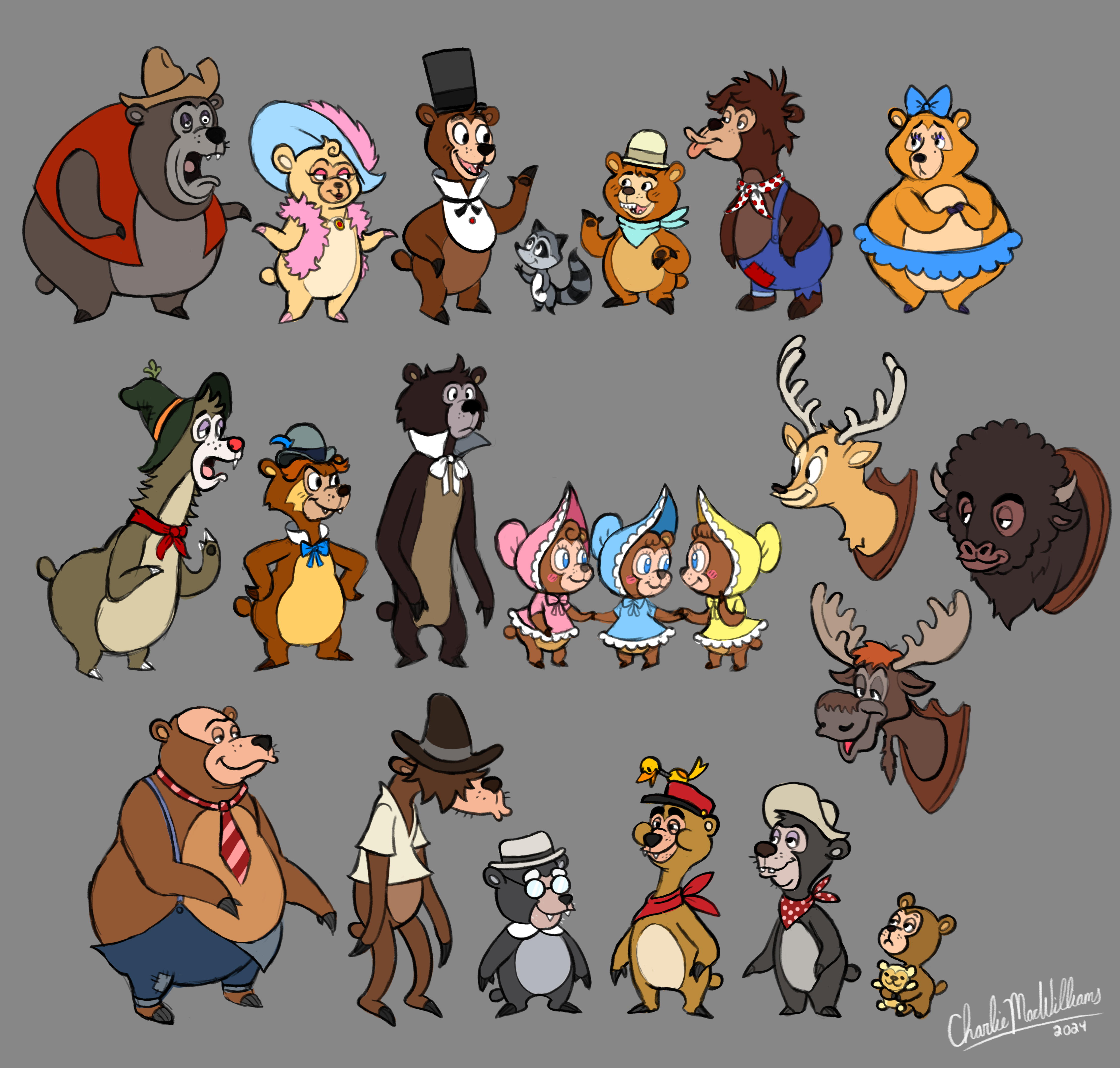
This is probably my most “famous” (and I say that lightly) piece of art I’ve done featuring the bears. The idea behind this batch of designs was “what if the Country Bears had an animated series?” I broke down each of the bears’ designs into simple, 2D designs that kept the essence of their more detailed Marc Davis illustrations and in-park animatronics, while also feeling fresh. I also aimed to have a wide variety of fur and face tones for the bears, instead of the kind of standardized face color and heavy use of brown fur the original show has. They’re a bit of a remix of the best traits of the various depictions of the bears- mainly the animatronic shows, but I did take some inspiration from the walk-around costumes and even a bit of the 2002 movie (which, while we’re talking about it, is an awful adaptation, but it’s not a bad movie. Disney, if you’re reading this- I can be the Guillermo del Toro to the Country Bear Jamboree’s Haunted Mansion. Hit me up.) I think out of all of these designs, Gomer is my favorite!
This next one is what I’d call a “hype piece,” as I started it the day of the Country Bear Musical Jamboree early previews and finished it not long after! Ernest the Dude has always been my favorite bear, so seeing him get the show-stopper moment was super exciting. I tried to go for a painterly style on this one that’s a bit more realistic than my normal stuff, and I still like how it came out…though with how much I’ve drawn the Country Bears since, I can definitely see where I can improve on this piece.

This oddly-shaped piece is a recreation of the painting featured on the original CBJ curtain, made for the WDWNT Museum. The museum has a dedicated Country Bear Jamboree area that has a recreation of the stage as a photo-op. I made the painting, while our other full-time artist, Billy, made all the advertisements and put it all together. Despite the original Country Bear Jamboree and its curtain surviving until 2024, long into the HD and 4K era of photographs and videos, there weren’t any high-quality photos or videos that I could find that got right up close to the curtain. So, I did a lot of guesswork based on various photos I could find. It’s not 100% accurate but it’s pretty darn close!


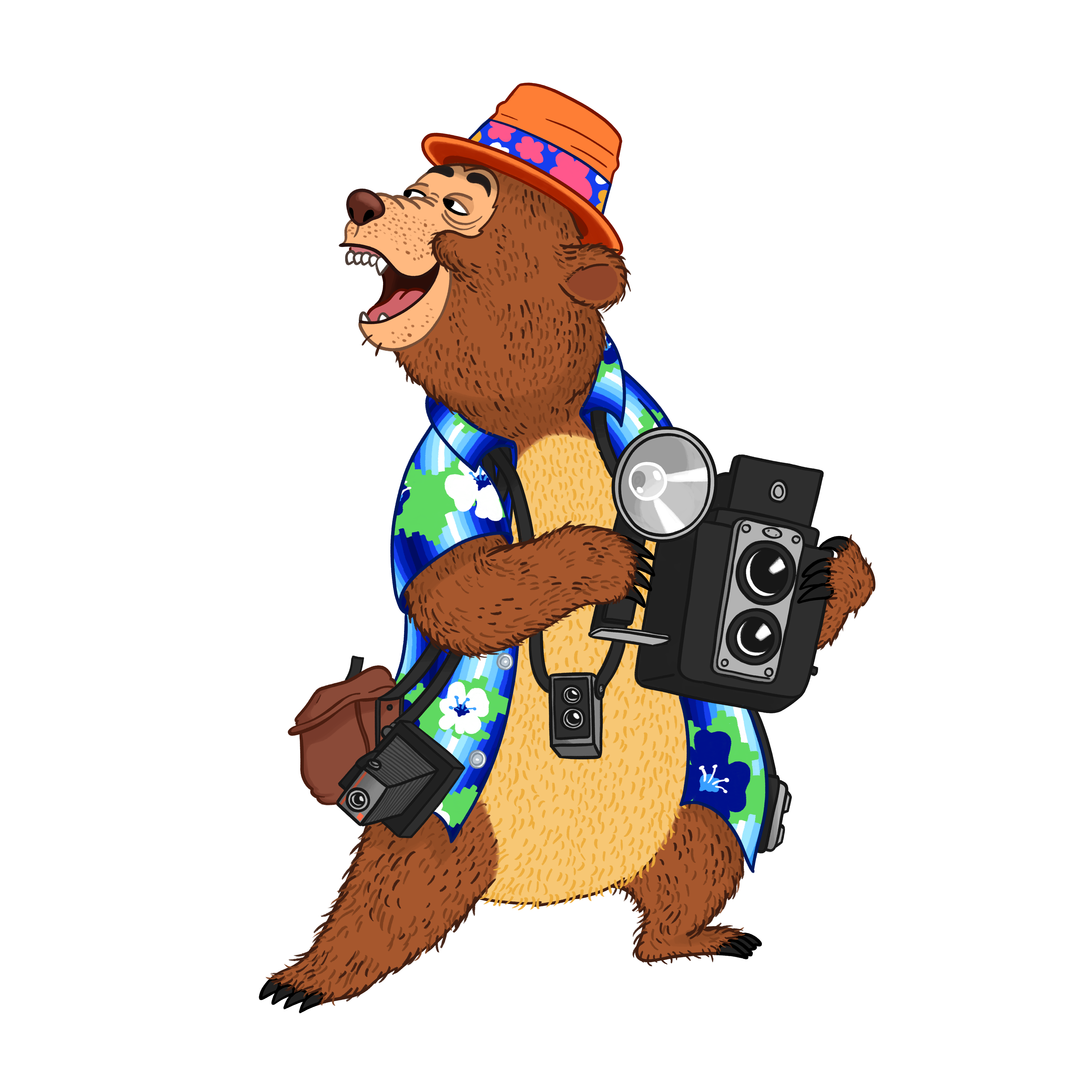
In the WDWNT Museum there is a sign telling people they can go upstairs to take pictures. For this I drew Wendell in his vacation outfit, which surprisingly was easier said than done (when you’re someone like me who wants to make sure the costume is 100% accurate to the animatronic, that is.)

I had to look up a LOT of reference photos for this one, trying to get every possible angle that would show me all of the little details the animatronic had, from his various cameras and camera bags to the exact pattern of the Hawaiian button-up- which interestingly had a sort of 8-bit pattern to it.
This one is one of the first pieces I did at WDWNT, parodying the Bubbles & Brine booth at Epcot’s Food and Wine in 2023. I had the very unique task of designing a shrimp in the style of Marc Davis, something I don’t think that anyone has done before. From what I remember of my research, it wasn’t even anything Marc himself had done before either! I wish I had thought to keep track of what I ended up using as reference, but I do remember it was a lot of mixing and matching of various traits of his style. My main thought process was, “if Marc had designed a crustacean, what would he have done to anthropomorphize it?” On that goal, I’d say it was a success!

A bit unconventional for an article about art, I know, but I felt I should include this WIP piece for a project I’ve been wanting to do. Inspired by Bunny Wars’ “Buzzy Identification Guide” showcasing every design of Buzzy over the years, I had the idea to give the Country Bears the same treatment. Not just Henry, not just Big Al… all the bears. It’s quite the undertaking, and likely impossible to get 100% correct. Through my research I’ve found that there were many, many minor changes throughout the show’s history, from small random details being added to entire fur changes for the whole cast. I put together a spreadsheet logging all the changes, though it’s not complete. If there’s anyone out there as crazy as I am who can fill in the gaps of my research, let me know!

This last piece is a warm-up sketch I did awhile ago of Henry and Wendell in the style of the Tokyo Disneyland CBJ illustrations. The art for the bears over there is full of so much personality and charm- if Disney were to ever do an animated CBJ movie (I already have a script outline, hit me up Disney), I think that should be the going-off point for the style. They’re a fantastic evolution of Davis’s original designs, and really showcase the bear’s individual characteristics- which is the other half of what makes the original CBJ so wonderful. You have the fantastic writing from Al Bertino that, combined with Davis’s designs, really created the first true park-original characters- not just nameless pirates or parrots all made from the same mold, but unique characters with unique designs, backstories, and personalities. Not only that, but the show has heart- despite all the comedy, these bears are a found family (the best kind!). A dysfunctional family barely keeping it together, but still a family nonetheless.
While the original show in its later years might have come off a bit dated or creepy, if you give the bears enough time, you’ll find the heart and charm beneath the 50-year-old-hydraulic surface. Just ask my wife- she went from being terrified of Wendell, to now loving him (those viral TikToks of him dancing in the park definitely helped with that.) They might not be the most popular nowadays, but I’ll always love these guys!

HONORABLE MENTION: Toys For Tots Livestream
This past Holiday season, WDWNT had its annual Toys for Tots Charity Livestream, where for 50 hours we streamed a variety of segments to help raise money for charity. I had a segment where I would draw requests for people if they donated (black and white sketch for any amount, color if they donated a certain amount.) It proved to be a success, as it alone raised nearly $1,300 for Toys for Tots! I had a lot of fun prompts to draw, from classic Disney characters like Powerline and Fud Wrapper to some funny scenarios featuring some bears I was more than happy to draw. I even got to do a little artwork for some Universal characters…


If you enjoyed this article, you will surely like the following:
Artist Spotlight Class of 2021: SonderQuest | Sam Carter | Brian Cooper | Sterling Decker
Artist Spotlight Class of 2022: Rob Yeo | Ava Buric | Jess Siswick | Hayden Evans
Artist Spotlight Class of 2023: Marie Catano | Savannah Hamilton | Bunny Wars
Artist Spotlight Class of 2024: Jaime S. | Jess Feldman | Bryan Bindman
Artist Spotlight Class of 2025: Brandon Starr | Kristi O | Henry Taylor
SATURDAY SIX Artist Spotlight: The Theme Park Artwork of Brian Gweon
SATURDAY SIX Artist Spotlight: The Theme Park Artwork of Phillip Weatherford (AKA The Horizoneer)
SATURDAY SIX Artist Spotlight: The Theme Park Artwork of Charlie MacWilliams
SATURDAY SIX Artist Spotlight: The Theme Park Artwork of Stephen Christ
SATURDAY SIX Presents: Artists Inspired by Universal’s VELOCICOASTER
SATURDAY SIX Presents: Artists Inspired by Universal’s EPIC UNIVERSE
SATURDAY SIX Presents: Artists Inspired by Universal’s HALLOWEEN HORROR NIGHTS
SATURDAY SIX Artists Inspired by HHN Series: Declan O’mara

You May Also Like...
-

This week the SATURDAY SIX Proudly Presents: The Theme Park Artwork of BRANDON STARR! To coincide with Disney’s Festival of the…
-

This week the SATURDAY SIX Proudly Presents: The Theme Park Artwork of HENRY TAYLOR! To coincide with Disney’s Festival of the…
Such a fun read and I’m always thankful of artists who share their inspiration and their behind the scenes processes for non-creatives like myself.