SATURDAY SIX Presents: The Theme Park Artwork of Rob Yeo (Books, Posters, Pins, Park Maps and More!)
This week the SATURDAY SIX Proudly Presents: The Theme Park Artwork of Rob Yeo! To coincide with Disney’s Festival of the Arts, each February the SATURDAY SIX spotlights four artists in the theme park community. Last year we began this annual tradition with features on Sam Carter, Brian Cooper, @SonderQuest, and Sterling Denham. In 2022, we are starting off with bang, spotlighting the amazing work of Rob Yeo. Living in England, Rob is the first person we’ve been able to spotlight who is outside of the United States. I personally have been a fan of Rob’s minimalist style for as long as I can remember and he was the very first person I thought of reaching out to when creating the Artist Spotlight series. Unfortunately our schedules couldn’t align in 2021, but after a year of my pestering and badgering eloquent requests, we are truly blessed to be able to present his work to you.
Rob Yeo: I was beyond flattered when Derek offered to dedicated an Artist Spotlight to me and my work – although, to me, an artist is still a guy in a smock and beret who makes oil paintings; I’m more like a computer full of ideas that’s hooked up to an unreliable 3D printer.
My first trip to a theme park was Disneyland Paris in 1994 and the moment I got there, I was hooked. From there my family and I had regular trips to WDW, and later as an adult I’ve since used my holidays to visit more parks all over the world.
Theme parks just ticked all my creative boxes; graphic design, storytelling, world building, insane depths of esoteric lore. Now I’m fortunate enough to work in that industry and put everything I’ve learned into practice, so I can hopefully inspire another kid to work on their own 3D printer.
# 6 – Posters
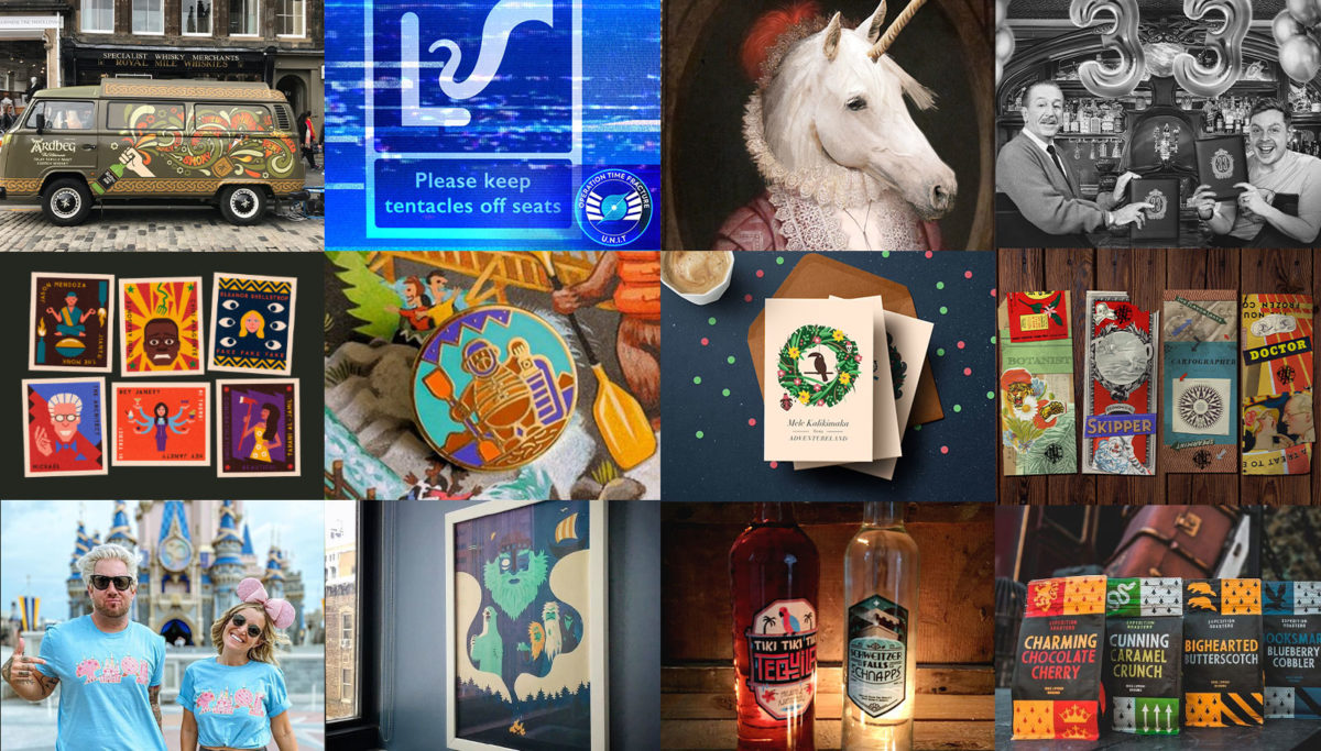
After I graduated with a degree in International Business and German (don’t ask), my big plans for being a less morally dubious Don Draper were dashed by reality; instead of Madison Avenue, I was unpacking boxes in a supermarket warehouse. I kept getting drawn back to creativity and ended up in the artiest job Tesco could offer – “designing” sale banners for pressure washers, vacuum cleaners and BBQs. Eventually I came to the realization that even though I considered myself an arty person, I hadn’t painted, drawn or even finger painted anything in years, so I started making attraction posters. I made a few which I liked (at the time) but the first one that took off was my tribute to Maelstrom, made just as the attraction closed. That was the first time something I posted on Twitter got more than 2 likes – game changing!

Since then, posters have been a staple of my work – sometimes serious, sometimes silly. Designing a poster is about taking a concept, understanding what makes it interesting, and then finding a cool twist on how to present it.


DEREK NOTE: The poster for Muppet*Vision 3D’s 25 anniversary is absolutely brilliant. The abstract style perfectly fits these whacky characters, and the poster is filled with iconic elements from Muppet*Vision that will bring fans of the show right back to reliving their favorite moments of one of the most underrated attractions in theme park history.

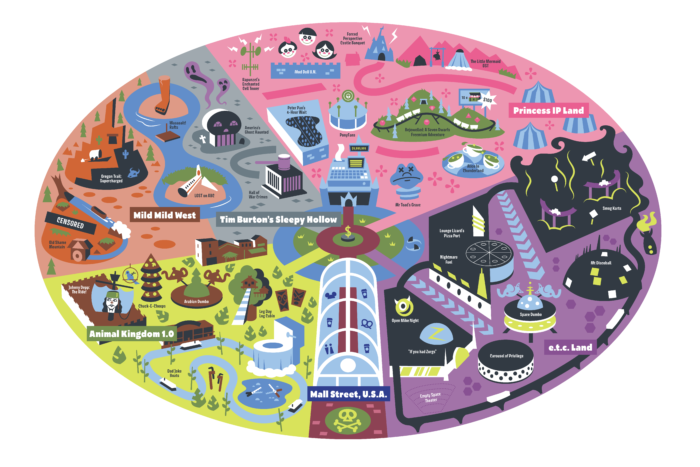
# 5 – Maps
I’ve got a collection of hundreds of park maps, all meticulously organized by park, year and language. These are little totems of excitement that contain all the promise of amazing theme park adventures.
When I was younger, my idea of a good time was buying a sheet of A1 cardS from Staples and drawing the maps for fake parks, and now people pay me to draw them? My school career advisor would never believe that.


DEREK NOTE: While the maps above were based on things that actually existed, the following maps are built purely from Rob’s incredible imagination. How great does Disney’s Dark Kingdom sound?!


DEREK NOTE: For those in America, an A1 size of cardstock would be about 23″ x 33″ in size. Like the metric system, the rest of the world uses paper sizes that is slightly different than what we use over here. As a person who collected comic books growing up, this drove the OCD collector part of me bananas because the size of American comic books were not the exact same as European comic books.
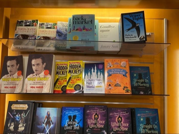
# 4 – Book Covers
Maybe I’m biased, but not only do I believe you should judge a book by its cover, but you should be obliged to buy a book simply because the cover is pretty.
Over the years I’ve had the pleasure of working with a number of awesome authors, and my job is to distill their words into something bold and eye-catching that can jump off a shelf (or, let’s be honest, an Amazon page).
For example, when creating the cover for Aaron Goldberg’s Buying Disney World, I wanted to capture the mood of Walt Disney’s mid-60s optimism and the promise of his Florida Project. Funnily enough, I have a photo from the meeting where I pitched the cover to Aaron (which you can see by CLICKING HERE.)

Aaron Goldberg (author of The Wonders of Walt Disney World): A book’s cover is so important, it is often the “ice breaker” so to speak. One can have a book with great content but if the cover is abysmal, many folks won’t even pick it up. With the theme park genre being a VERY crowded marketplace, my books have always stood out from the rest, thanks to Rob.
Without sounding like an egotistical jerk, I think my book covers are the best. They are second to none, not only in the theme park genre but also in non-fiction. Now, with that being said I honestly have very little to do with their greatness. My covers are one hundred percent due to Rob’s genius, intuition, and creativity. As the publisher and author, Rob makes my process incredibly easy. I give him the book title and usually the introduction or description, then he works his Yeo magic.
Rob always captures what I want without me even knowing what I want. People often compliment me on my covers. I always say I hope my content lives up to the greatness and creativity of the cover. Over the years, my books have become best sellers and award winners. A huge part of my success is owed to Rob for the covers, illustrations, and maps he has created for me.

Aaron Wallace (author of The Thinking Fan’s Guide to Walt Disney World: EPCOT): Anyone who has worked with Rob or who follows him on social media knows that he’s not just a great artist — though he IS that – but he’s also a true fan with a really clever sensibility. You see that, for instance, in his cover art for The Thinking Fan’s Guide to Walt Disney World: Epcot. It’s a killer design for the 21st century, so it speaks to today’s Epcot, but it has all the iconography of EPCOT ’82 and even the 1964 World’s Fair, which are all so central to the book and to the park itself.
I remember asking Rob to convey a sense of awe and wonder, to really capture the book’s reverence for Epcot and EPCOT Center. He did that by doing what vintage concept art from the parks and World’s Fairs used to do — silhouettes of people walking toward impossibly grand attractions, and Rob even has one of them pointing up in astonishment. It sparks an emotional reaction, and that’s what I wanted. If you look at the way he presents Spaceship Earth on that cover, it’s almost celestial. If you look at his nods to World Showcase, those buildings look like mountains. They’re almost like the Gates of Argonath in The Lord of the Rings. I thought, “YES! That’s how I feel about this place. That’s how I write about it, I hope.” I’m so grateful his design could capture that. I genuinely love it.

Christopher Smith (author of A Magical Half-Century): Rob is the best in the business when it comes to creating a cover that captures the spirit of an entire book. I have worked with many artists over the years, and nobody compares to Rob when it comes to talent, communication, work product and, most of all, integrity. I am an attorney by trade and, in complete honesty, probably the least artistic person in the world. In many cases, I have no idea what I want when it comes to a book cover. But Rob reads the work, tries to understand my thought process and inspiration, and uses that information to create something special. A tremendous amount of trust and, thankfully, friendship has grown from our working relationship. When I need a book cover, a map, or an illustration of any kind, there is only one person I call: Rob.

Christopher Ripley ( Horror and HHN History Author): Rob is one of my favorite artists and possibly one of the nicest guys to work with. He is very imaginative, diligent, conscientious, hardworking, and has a great eye for detail. His style is incredibly unique and often copied but never surpassed. He is a joy to work with and both books he has designed for me had excellent feedback for their cover designs. His design for my Hollywood HHN book is often complemented by my readers, with several requesting we make posters of it! He has also designed HHN air fresheners and a fabulous lanyard for me, all of which were highly popular.


I’ve also illustrated the insides too, which provides the interesting challenge of drawing without color, something that I rely on for literally every other piece of art I do.

My caveman brain still can’t comprehend when people send me photos of the actual books in actual bookshops!

# 3 – Pins
I absolutely love making pins – they’re rad, subtle ways of wearing your own artwork, they’re great gifts, and when they’re based on an obscure, extinct attraction, they’re a secret message to fellow geeks.
They all started because of some simple logo-esque designs I did, celebrating the iconography of Future World in 1996. These combined my love of illustration and graphic design, and it was a fun challenge to boil down an idea to something that works on a 25mm enamel pin. Plus, they’re all just total nostalgia for my childhood holidays to WDW, a theme that runs through everything I’ve ever drawn.
Five Kickstarters later, I’ve done sets based on DCA 1.0, Tomorrowland 1994, Disneyland Paris 1995, and Disney-MGM Studios 1998.


DEREK NOTE: To see even more of Rob Yeo’s pin designs, CLICK HERE.
Rob’s most popular pin may actually be the charming “All of my best work is under NDA.” The theme park community is filled with people who have worked with Disney, Universal, and other theme parks on a creative basis. Much of this work will never be seen by anyone, because not everything is actually made by the theme parks and instead languishes in what people in the industry call development Hell. Jim Hill of the Disney Dish Podcast can often be heard saying, “there are no ideas at Disney thrown away, as years later they may be repurposed for another project.” Because the projects may move forward eventually, the creative people work under a Non Disclosure Agreement (NDA) and aren’t allowed to share any of their work.)

# 2 – Themed Entertainment Design
Speaking of NDAs…
Growing up, my dream was always to be an Imagineer, but it felt as realistic a goal as that weird kid in my Year 3 class who wanted to be a tiger.
I read all the books, watched all the documentaries, and all of my WDI heroes had the same story:
- Grew up 15 minutes from Disneyland
- One day Walt offers them a job
- ???
- Building theme parks
Not a lot of help for a designer born on the wrong continent and several decades after the great man had gone. I reached out to my fellow Brit, former Imagineer and current friend/mentor/annual podcast co-host Andy Sinclair-Harris who encouraged me to build a portfolio of personal projects to at least show people what I could do. And it worked!
I got to design the wallpaper for [REDACTED], I’m developing a water park for [REDACTED], and next time you ride [REDACTED] check out all the [REDACTED] – those were my work!
I still design personal projects for my portfolio – some of my favorite ones were for the The Tip Top Club – finally opening a themed bar for Tower of Terror, complete with collectible mugs and special effects!


I designed a Jurassic Park tiki bar – Isla Nu-Bar. A year later, a real Isla Nubar opened at Universal Studios Hollywood in what my solicitors have advised me to describe as a “happy coincidence.”


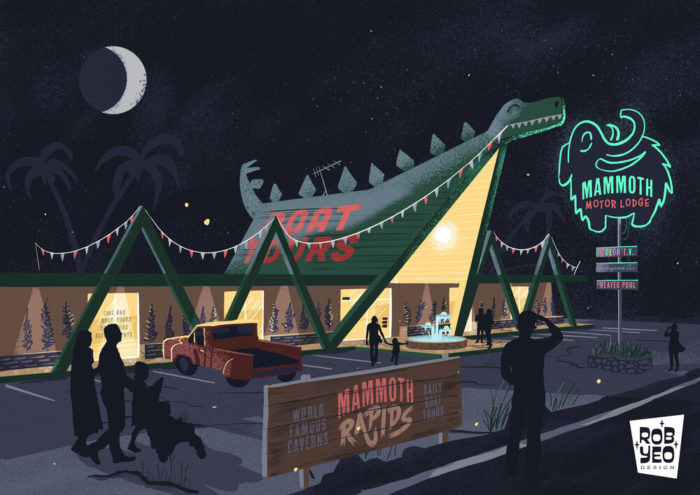
I also designed my own attraction for the Storyland Studios Design Challenge: Mammoth Rapids – a raft ride designed to replace Chester & Hester’s Dinorama.


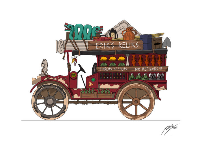
Adventure Cove – This was a spec project to design a land entrance for an adventure themed area. I decided on a lost island theme, set in the Bermuda Triangle; home to lost explorers, stricken ships and crashed planes.
The goal was to convey as much of the story as possible just through the design, props, lighting and landscaping.

I also carried this theme into a merchandise cart – Erik’s Reliks. The story here is a shipwrecked paleontologist with a less-than-noble past is selling his ill-gotten finds from his old jalopy.
# 1 – 3D
Ever since I was a kid I’ve always gravitated towards whatever medium helped explain my ideas best; Disney of course has a proud tradition of scale models of lands and rides, so I wanted in on that too! When I was 11, I built my ride ideas out of cereal boxes and tape (WDI, if you’re interested in a Mr Toad-style black cab ride though London in the UK Pavilion, DM me!). Then I moved onto the computer where size and materials were unlimited, (providing you had the right cheat codes) and built parks in Rollercoaster Tycoon, and then Minecraft.
Back in 2020 I finally took the plunge and did one of my least favorite things – learning new software. I took an online tutorial in Blender which let me convey ideas and spaces that just couldn’t be done as 2D illustrations. My ambition is always a good distance ahead of my actual skills, but with each project I’ve tried to push myself further and further.
My first big project was recreating the queue of the old Animation Tour at Disney-MGM Studios – I’ve always had a love of these atmospheric spaces where you can leave the crowds sit on a bench and just enjoy the background music and take in the theming. I had to trawl through hours of 90s vacation videos to get the layout right (the placement of each concept art “window” was a lateral thinking puzzle that made Myst look like Tic Tac Toe. Then I took it a step further by adding in the actual music, the sound of the fans, distant fireworks and Cast Member spiels to make you feel like you’d stepped back into a warm evening at the park in 1997.


Next, instead of recreating an existing space, I thought it’d be cool to design a never-built one. I’d been fascinated by plans for Disneyland’s “Tomorrowland 2055” overhaul, and blueprints had popped up on auction sites, so I decided to piece them together and see how it could have looked.
As always, it snowballed quickly. I started with the Alien Encounter building, which was complex enough, but it connected to Space Mountain with a bridge, so I had to build those. Then on the other side it connected to the Carousel of Progress replacement, so I had to build that too. Then I wanted the whole scene from the perspective of the PeopleMover station, so I built that too! Finally, there were lots of areas that didn’t exist in concept art, so I got creative and filled in the blanks: an Interplanetary Plaza, filled with lights and water features, Robot Charging booths and an Art Deco design of the PeopleMover cars.


My most recent project was to build another beloved location from my childhood – the water tank area of the old Backlot Tour. This followed the same principles as before, but this time I wanted it to look as real as possible. That meant days of agonizing over textures, painting in rust, grime and dirt, working out how to make puddles, realistic morning light and recreating the old graphics. I’m so proud of the outcome, and will be doing another atmosphere video, once I learn how to make the water ripple realistically, that is…


Honorable Mention – Armchair Imagineering
Back when the pandemic first started, everything closed, the world was suddenly stuck at home, and we all got a collective case of cabin fever. With the entire themed entertainment industry furloughed, fired, or just bored I thought it would be fun to set designers a themed entertainment challenge, and see what they came up with. I called it Armchair Imagineering.
I was completely unprepared for the response; I was expecting maybe 5 responses to the prompt, I got nearly 100! For each challenge, I saw artists take what I considered a pretty straightforward brief and interpret them in directions I never would have imagined.
For example, I had a pretty clear picture of what a “Food Cart for a Haunted Forest Land” should look like, but the responses ranged from a food truck run by a Hipster Frankenstein, to an Emerald City carriage, a “Onward” inspired ice cream truck and even the building itself being a giant crab/spider monster! The variety and creativity was astounding (especially as the prizes were just gold stars!) – and each challenge raised the bar; submissions became flythrough videos, whole pitch documents with storyboards and technical breakdowns.
For example, let’s take a look at “A Cadaverous Parlor” by Hayden Evans.
It’s no secret that I’m a huge fan of Hayden’s work – his style is just so distinctive and appealing. His entry was especially beautiful and atmospheric, and really evoked that spooky forest mood.

“Gastronomic Provisions” by IG: echolakeart
Olivia’s entry won Best Backstory, so I highly recommend you read her submission: https://www.instagram.com/p/B_
Like any great themed entertainment project, this is all communicated in the visuals. A carriage overrun by freakishly huge fungi was such a great, iconic visual, and won us all over.

“The Balete Tree” by Jojo Leovonchiong & Michael Matthews
This concept from Jojo and Michael absolutely floored me – the gorgeous artwork alone looks like it could be concept art from a horror movie! I was fascinated by the Filipino mythology too – not being based on a movie or story I was already familiar with made it feel so fresh and unique (plus those hanging wrapped humans would definitely give me nightmares if this ever got built)

Another Armchair Imagineering challenge involved creating a new spinner ride, and boy was I blown away by the submissions!
“Excavator” by Lars Van de Crommert
This entry won the Spinner design challenge because it ticked every box, and a few we didn’t even know we had. There’s a solid backstory, architectural concepts a full queue breakdown, cast member uniforms, and most impressively of all – a full 3D flythrough of the ride complex! See more of this amazing design by CLICKING HERE.

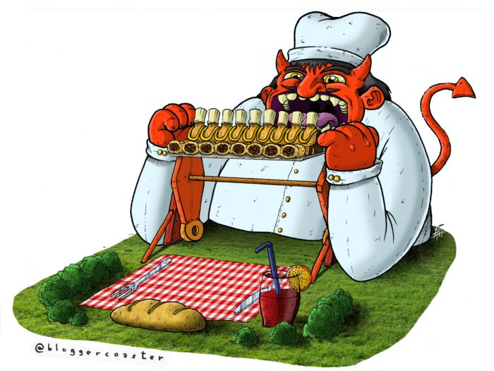
“Pietro’s Evil Cannelloni” by @bloggercoaster
This idea was so bonkers and genius, it just transfixed me. In a time when parks are getting more and more serious, striving to get ever more immersive and authentic, this is a great reminder that ultimately, theme parks are silly places we go to have fun – and this is all about the fun!
A Criminal Take on a Topspin Ride – by Albert Vleer
The biggest challenge of this brief – how do you explain the ride mechanism and the movement? Albert came up with a great concept – a literal mob shakedown. You’ve been lured to a seedy dock where this mechanism is going to shake out that money you owe them. A really fun concept, with great concept art!

I have to thank Disney Dan for taking it to a whole new level by producing the videos where we critiqued and celebrated each wonderful entry.

To check out Rob’s wonderful Armchair Imagineering challenges, including the amazing submissions for each, CLICK HERE!

DEREK’S OWN HONORABLE MENTION: The EPCOT Barges Poster
Derek Burgan: One of the cooler pieces of merchandise that Disney has released over the past several years was a series of posters done for EPCOT done in a retro style. These posters featured attractions that are long gone, such as Kitchen Kabaret and the Living Seas, as well as attractions around today and coming soon, such as Harmonious and Moana’s Journey of Water. While people online were losing their minds about how cool these limited edition posters looked, Rob unveiled his own poster featuring the monstrosity known as the Harmonious barges that currently pollute World Showcase Lagoon. I absolutely LOVED it.

To get your doctor’s full daily recommendation of the Rob Yeo Experience, be sure to check out his website at www.robyeodesign.com
To purchase items featuring Rob’s amazing designs, check out these links: https://society6.com/robyeo (I highly recommend the Grizzly Peak print) and www.etsy.com/uk/shop/RobYeoDesign (where you can get the wonderful NDA pin among other items.)
Rob can be found on Twitter: @robjyeo and Instagram: /robjyeo
So there you have it: The Theme Park Artwork of ROB YEO! See you next weekend for the latest installment of the SATURDAY SIX, where we’ll look at something fun from the world of Disney and Universal. If you enjoyed yourself, be sure to check out the THEME PARK ENJOYMENT INDEX, giving a monthly recap of all the theme park news you need to know (and a lot more you don’t need to know, but we’re gonna tell you anyway). You can also follow Your Humble Author on Twitter (@derekburgan).
If you enjoyed this article, you will surely like the following:
Artist Spotlight Class of 2021: SonderQuest | Sam Carter | Brian Cooper | Sterling Denham
Artist Spotlight Class of 2022: Rob Yeo | Ava Buric | Jess Siswick | Hayden Evans
Artist Spotlight Class of 2023: Marie Catano | Savannah Hamilton | Bunny Wars
Artist Spotlight Class of 2024: Jaime S. | Jess Feldman | Bryan Bindman
Artist Spotlight Class of 2025: Brandon Starr | Kristi O | Henry Taylor
SATURDAY SIX Presents: Artists Inspired by Universal’s VELOCICOASTER
SATURDAY SIX Presents: Artists Inspired by Universal’s HALLOWEEN HORROR NIGHTS
SATURDAY SIX Artists Inspired by HHN Series: Dead Skull
Special Thanks to The Elite Brandon Glover, Digital Maestro Scott Walker, the bio-est of all reconstructs @bioreconstruct, Captain Cruiseline Scott Sanders of the world famous Disney Cruise Line Blog, my personal protege Hunter “Elvey” Underwood, artist @SonderQuest, the mighty maven of merchandise Hedgehog’s Corner, the SAT SIX Fun Squad of Parkscope Joe and “the Dadalorian” Nick, hot shot Michael Carelli, charter member of the Universal Four @Nitro230, and Hermione Granger’s tutor Megan Stump for their invaluable assistance with this article. Absolutely no help was added by SeaWorld Influencer @SuperWeenieHtJr. The SAT SIX is inspired each week by goofballs Aengus Mackenzie and LitemAndHyde and you Potterheads will enjoy Meg’s other blog work over at the Central Florida Slug Club.
NEXT WEEK: The SAT 6 Artist Spotlight returns with AVA BURIC!

You May Also Like...
-

This week’s SATURDAY SIX takes a look at theme park news via MEMES! With the recent announcement of the re-opening of the Universal…
-

This week’s SATURDAY SIX takes a look at theme park news via MEMES! This week has been the longest year on record, and…
-

The parks are reopening soon (July 11 for the Magic Kingdom and Disney's Animal Kingdom and July 15 for Disney's Hollywood…
-

This week’s SATURDAY SIX takes a look at how we theme park fans are handling quarantine! We've all been sheltering in place for…
I don’t understand the video, it’s seems to be the same thing over and over, with the same scene for a minute or two at a time, then they repeat, is there something I am missing? In have only watched for 15 minutes though, maybe I need to watch longer?
Wow – Great stuff! Thanks for introducing me to all the wonderful things he’s done. The artwork style of the posters (only a few solid colors, no shading) is similar to several of the Disney jigsaw puzzles I bought in recent years. Did he have a hand in those?